Amazon · Ask Rufus
What they do
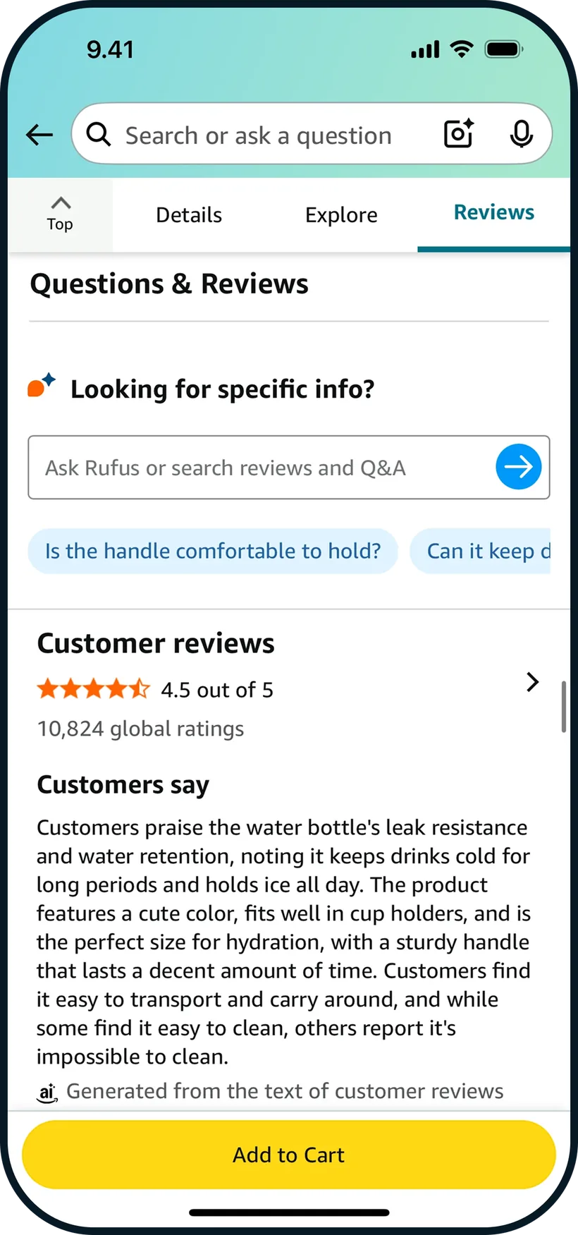
Ask Rufus sits on the product page with tappable questions like “Is the handle comfortable to hold?”
What I took
- Suggested question chips, so users see what to ask

Problem
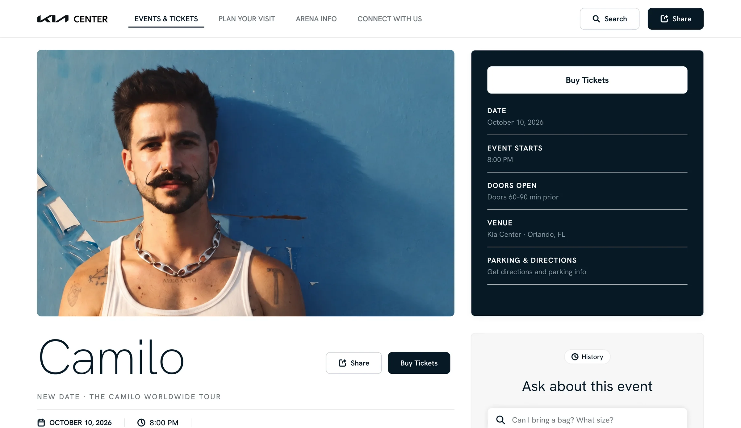
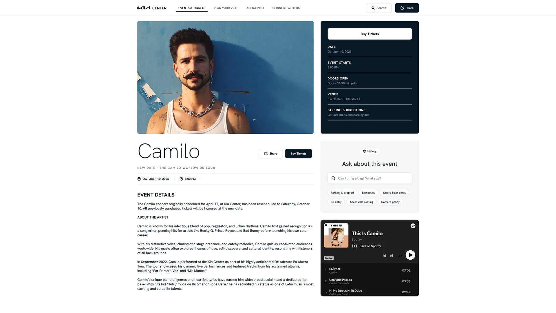
While browsing the web for tickets to the Camilo concert in Orlando, I landed on the Kia Center website.
The project grew out of curiosity, seen through the eyes of a fan trying to plan a trip.
Problem
Problem statement
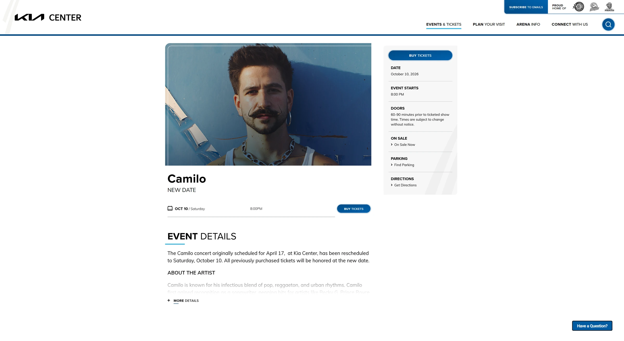
Venue websites have been pushed to the edges of the fan’s buying journey.
Fans find shows on social media, buy tickets on Ticketmaster, and increasingly get planning answers from AI search summaries that draw on the venue’s own content. What’s left for the venue site is a reference page people check for the bag policy. That does little for the revenue venues depend on, like parking, premium seating, food and beverage, and sponsorships.
Research
Venue sites get left out of the shopping path because each step that matters commercially happens somewhere else.
of superfans first heard about events on social media. Word of mouth reached 22%, twice the 11% who heard directly from organizers.
Eventbrite, Australian music fans
of revenue at MSG Entertainment is sponsorships and suites, the biggest line after tickets. Rentals reach 26% at the Orange County Convention Center, leases 18% at U.S. Bank Stadium.
MSG 10-K; Orange County Comptroller; MSFA
WCAG rules since the 2008 rewrite (61, then 78, then 86), pushing sites to be easier to read, for people and for AI tools.
W3C, WCAG 2.2; DOJ rule, 2026
of all web traffic is bad bots, from 2021 to 2025. Ticketmaster ties transfers to its app, with barcodes that refresh every 15 seconds so screenshots can’t be resold.
Imperva, Bad Bot Report 2026
click a result when Google shows an AI summary versus when it doesn’t. Just 1% click a link inside the summary.
Pew Research Center, 2025
Research
Research
Research
A three-week sprint meant picking two. Each one traces back to more than one finding.
Answers fan questions and surfaces parking, upgrades and food options in the results.
Findings 2 and 5: the ticket isn’t where venues make money, and planning happens in search.
Replaces static PDFs with an accessible map that fans have to open the site to use.
Findings 2, 3, and 5: parking revenue, accessibility, and outdated information.
Branding
Branding
#05141FPrimary dark elements & text#2592E3UI accents#70797FSecondary text & muted UI#D2D2D3Borders, dividers & subtle fills#EBECEDPage backgrounds & cardsNavy holds date, doors, venue, and parking together under Buy Tickets.
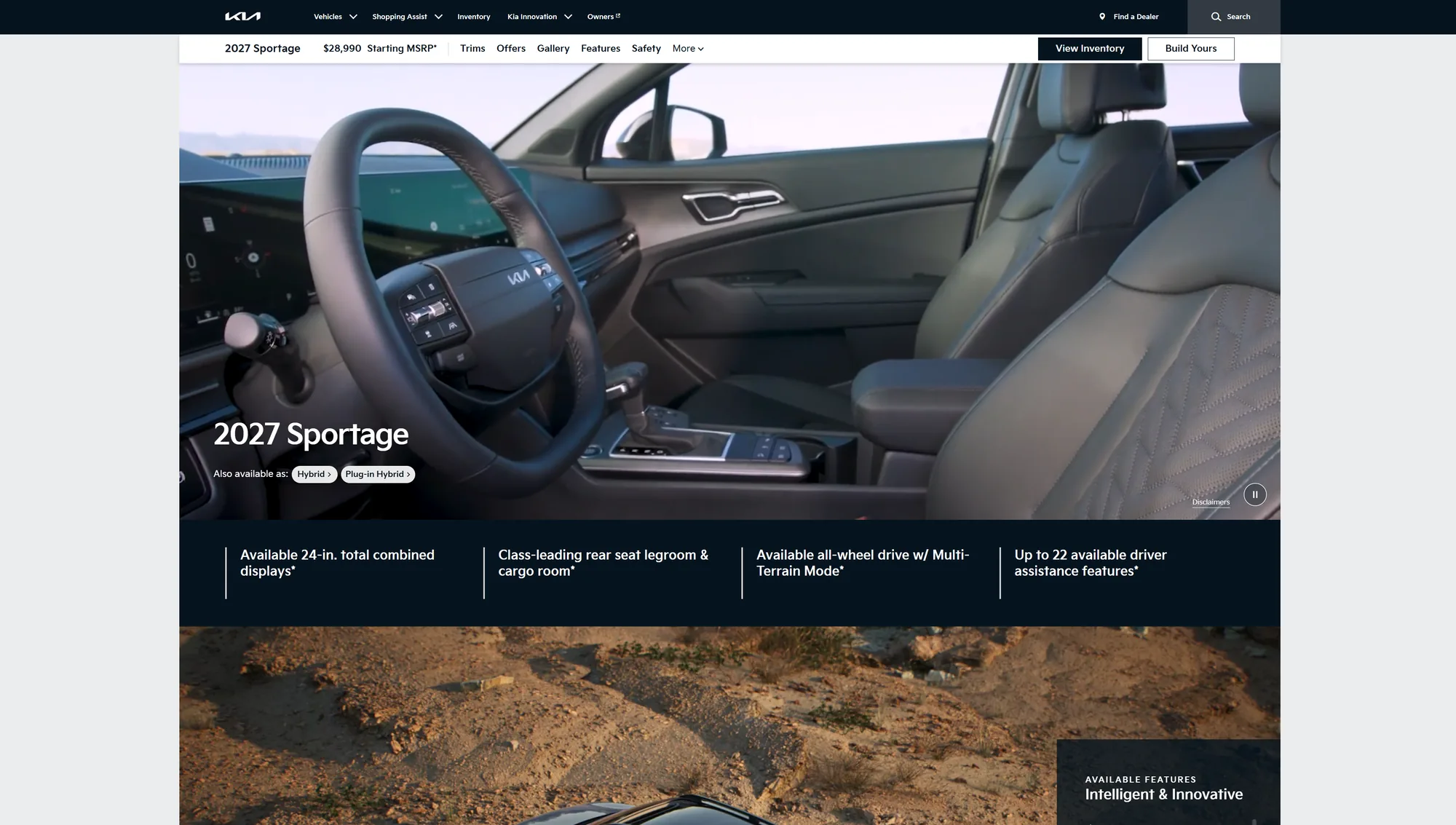
The artist's name set large in a thin weight, like Kia's model pages.
Grays and navy do the work; Sky Blue only marks what you can act on.
Branding
Branding
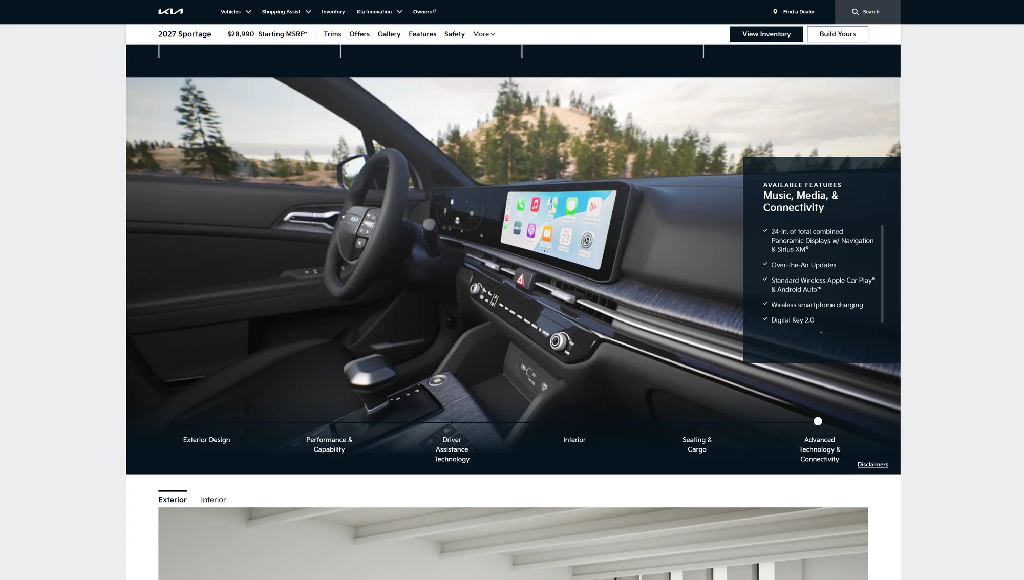
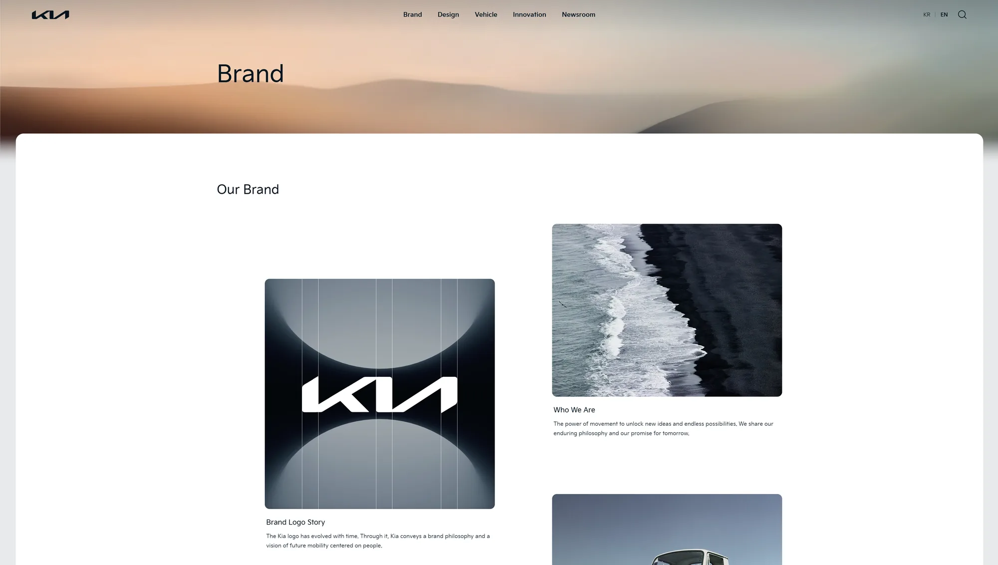
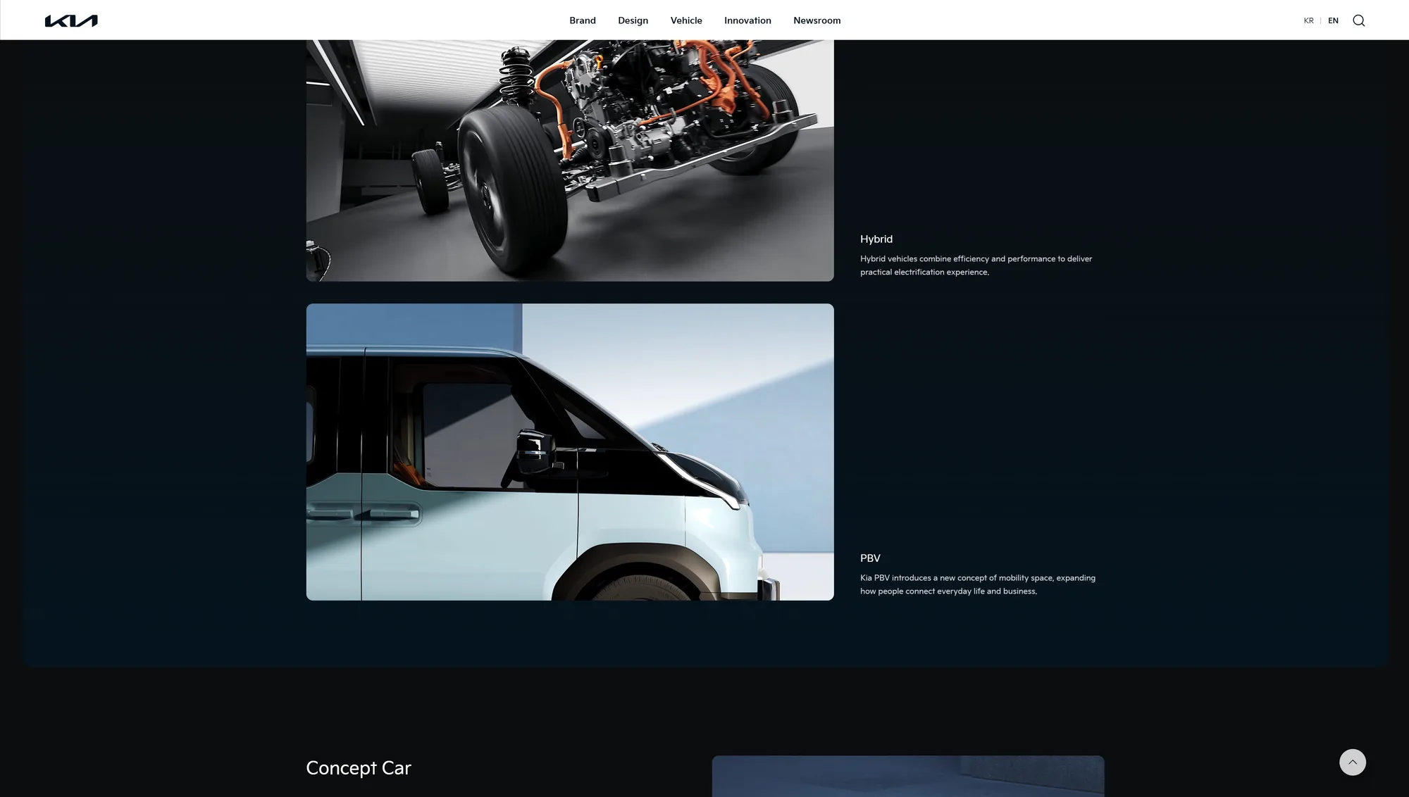
The event page rebuilt in Kia's own design language, drawn from the brand pages and logo lockups I studied.
Feature explorations
Two for answering a question in context, two for helping people find their way around a place.
Feature explorations
What they do
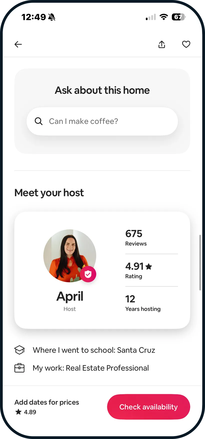
Ask Rufus sits on the product page with tappable questions like “Is the handle comfortable to hold?”
What I took
What they do
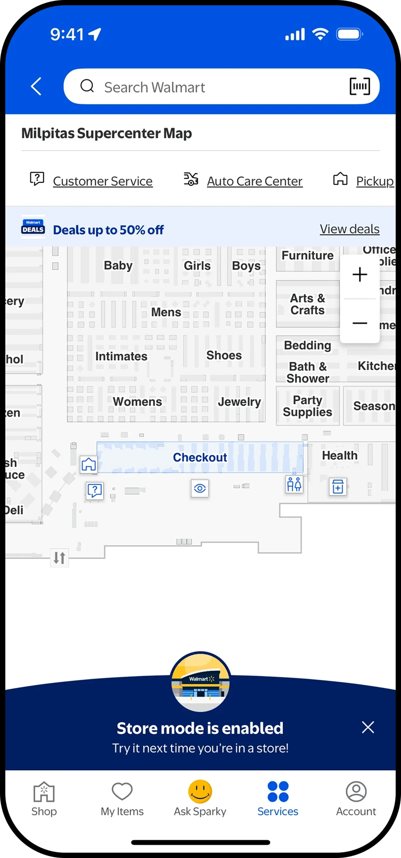
“Ask about this home” lives on the listing and only answers about that home.
What I took
What they do
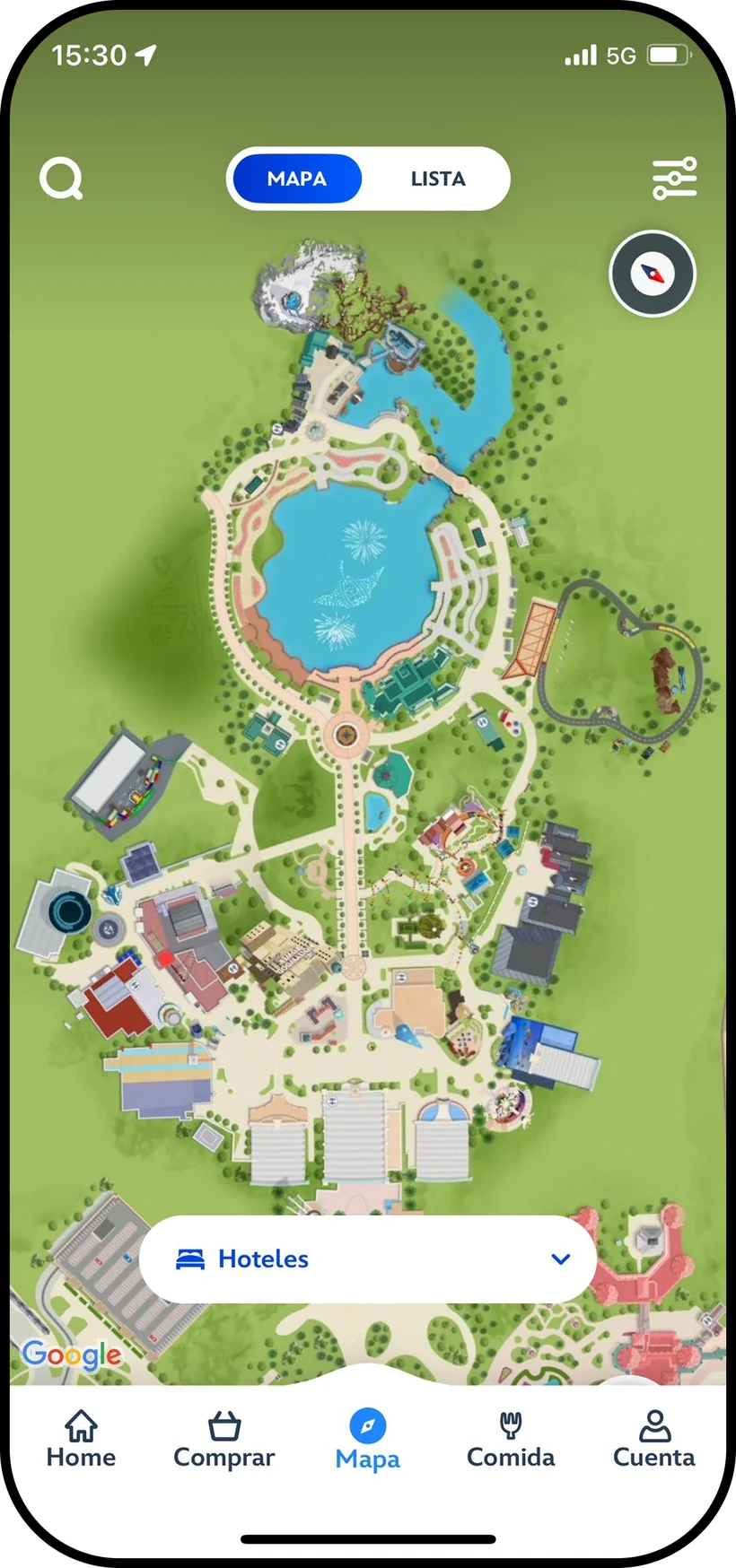
The store map lives inside the app, with departments, Customer Service, Pickup, and Checkout labeled, plus zoom controls.
What I took
What they do
An illustrated park map with a Map and List toggle and a category picker, like Hotels, to narrow what’s shown.
What I took
Solution
How might we make the venue site the most useful and trusted place to plan a visit, so that traffic turns into revenue the venue can measure?
Solution · Smart Search
Feature 1
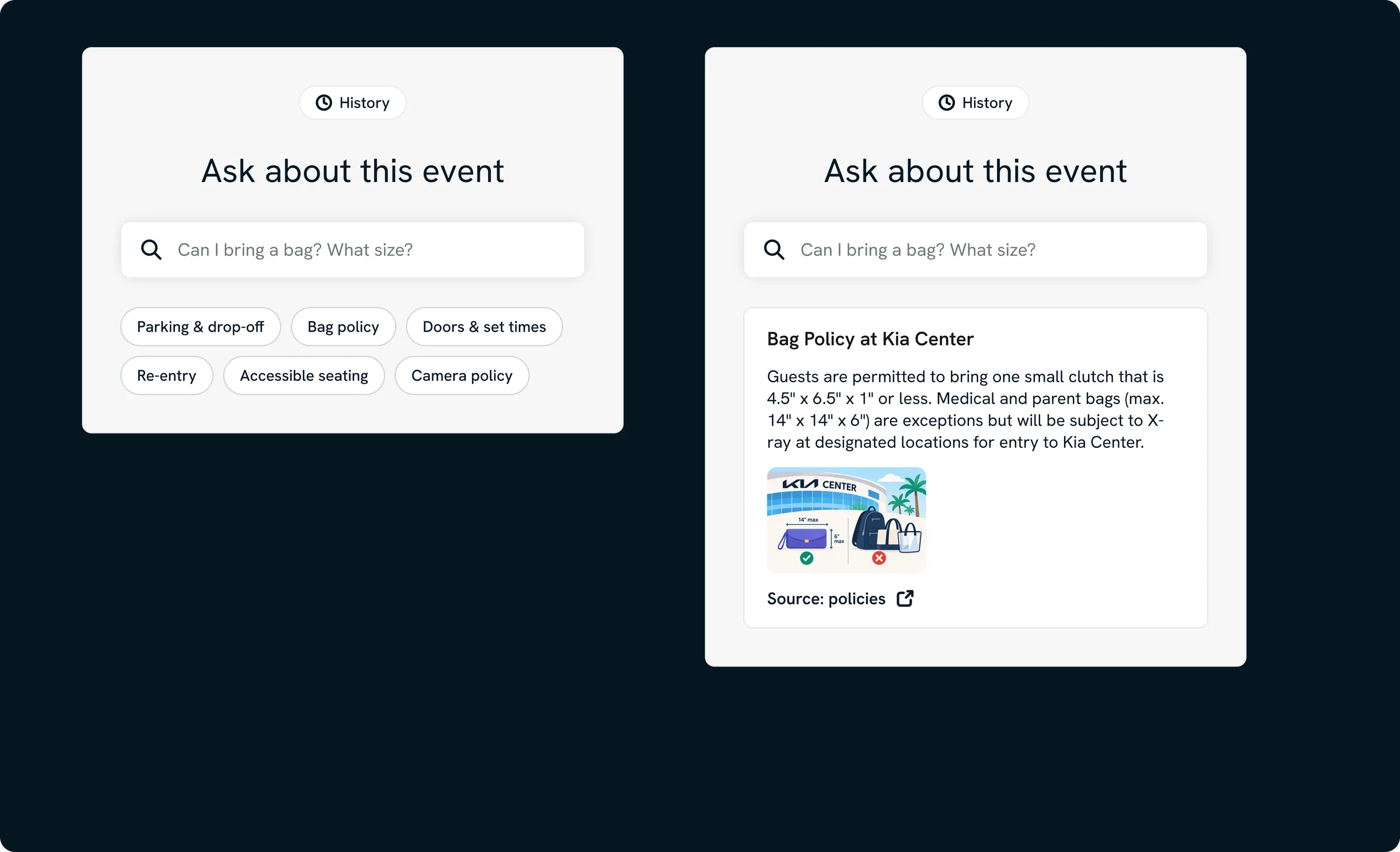
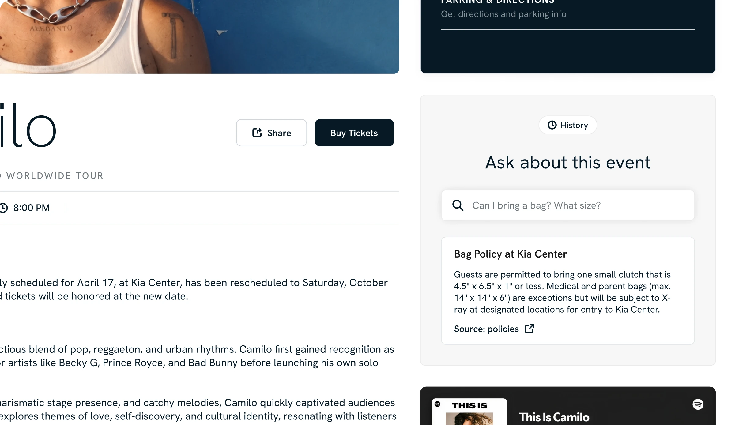
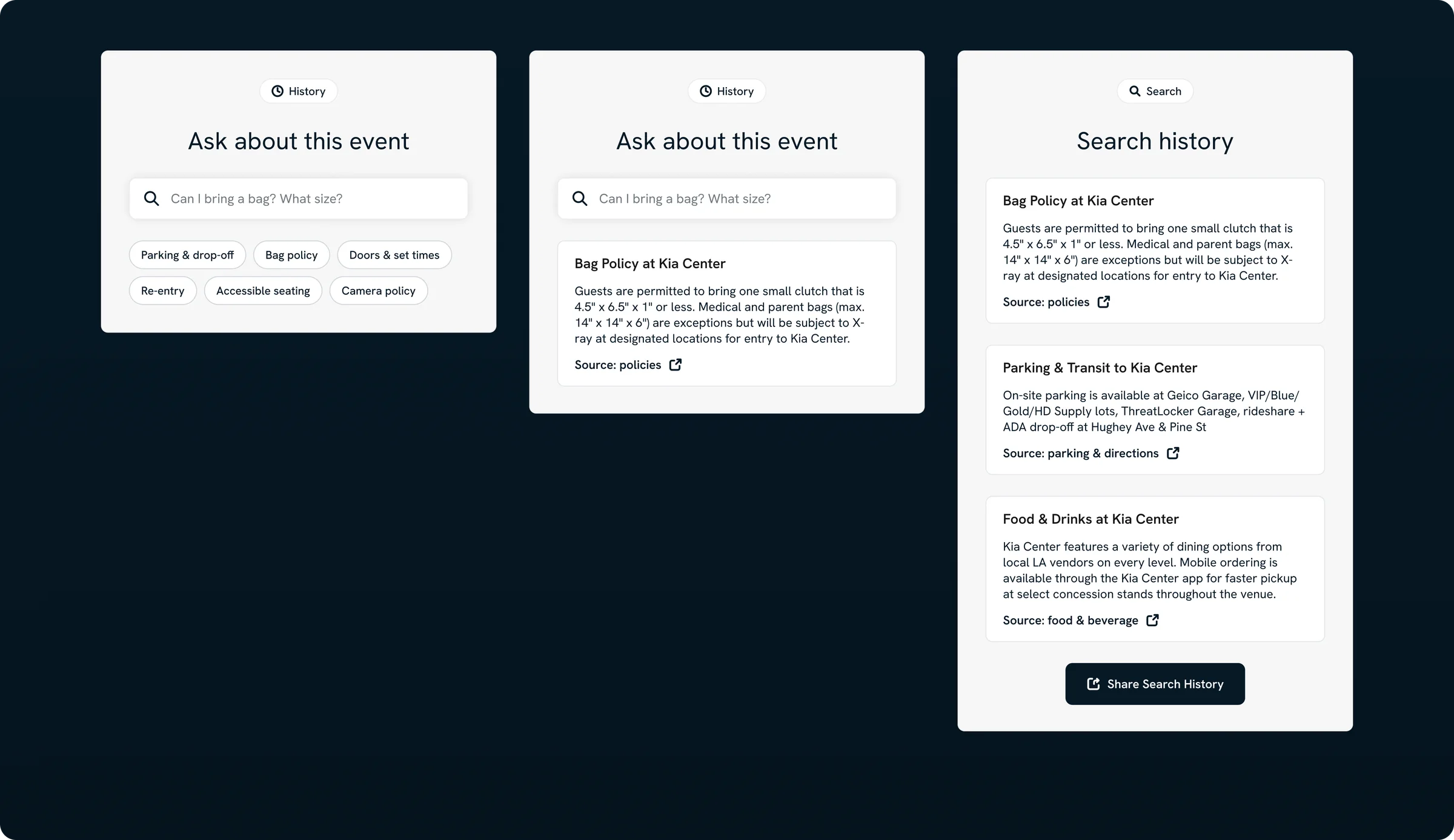
Answers fan questions right on the event page with exact quotes from official venue pages and a link to each source, so planning happens on the venue’s site instead of in a search summary.
Key decisionSearch, not chat. Fans want an answer, not a conversation, so every result is a quoted, sourced card.
Solution · Smart Search
 1
2
3
4
“Can I bring a bag? What size?” shows what to ask.
Parking, bag policy, doors, re-entry, accessible seating, cameras.
Answers quote official venue pages and link back to them.
Past questions stay with the event.
Solution · Interactive Parking Map
Feature 2
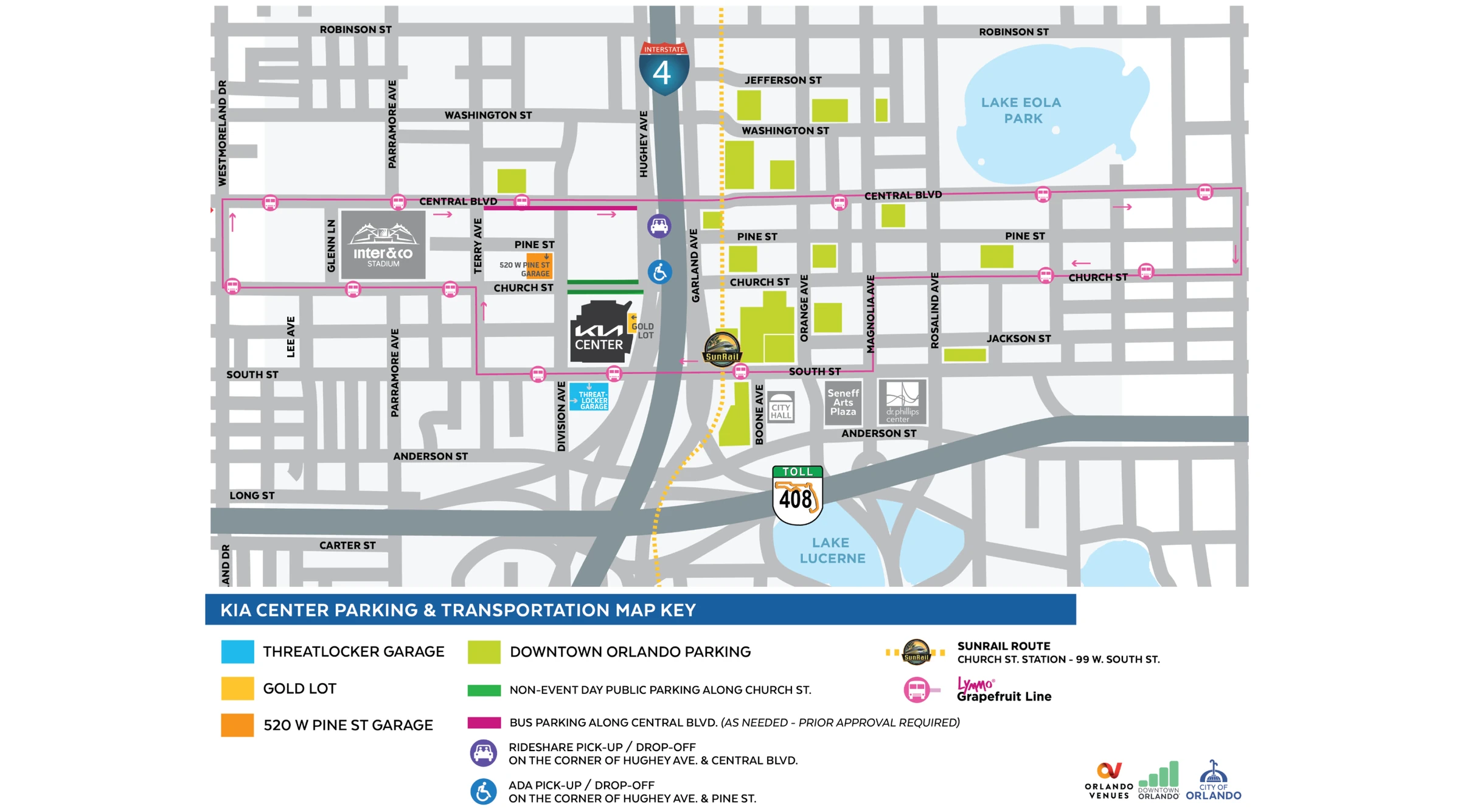
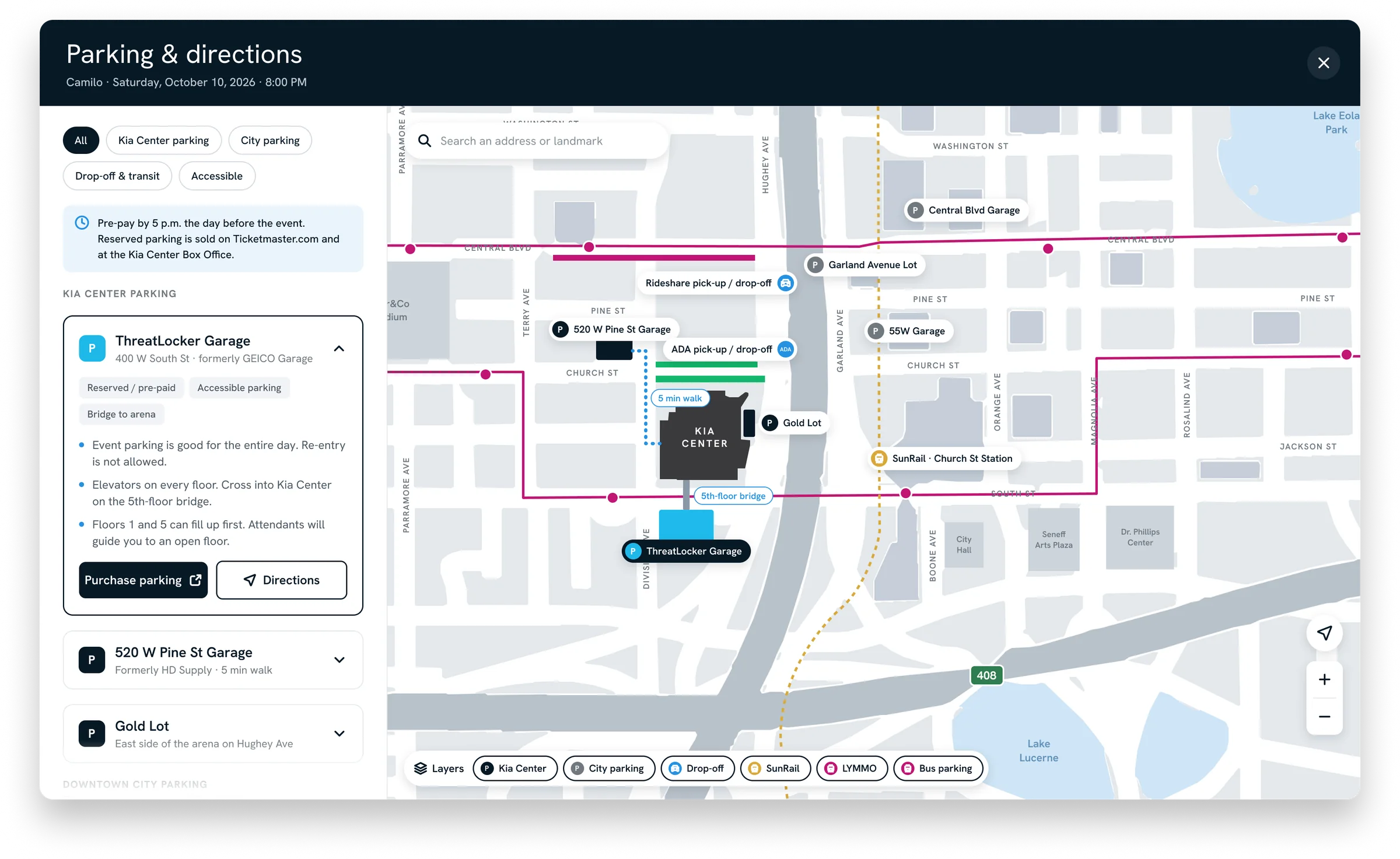
Replaces the static parking graphic with a map that opens from the event page. Venue garages, city lots, drop-off, transit, and accessible options sit in one place, each with directions and a link to pre-pay.
Key decisionA map, not a PDF. An interactive map gives fans a reason to open the site, which a search summary can’t copy.
Solution · Interactive Parking Map
1
2
3
4
5
All, Kia Center parking, City parking, Drop-off & transit, and Accessible.
Pre-pay by 5 p.m. the day before the event, with where to buy.
Tags like Reserved and Accessible, plus re-entry, elevators, and which floors fill first.
Purchase parking, or get directions from the same card.
Kia Center and city parking, drop-off, SunRail, LYMMO, and bus parking.
Solution
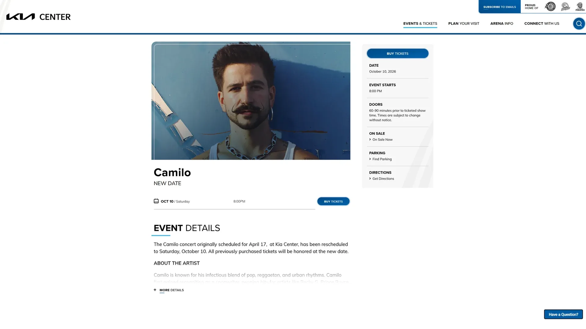
The same event on the same screen. Drag to compare.
Reflection
Working against a live, public site meant the problems were already there to be found.
It made me pick the two features that mattered most instead of redesigning everything.
Designing it, then building and deploying it myself, meant every decision had to survive a real browser.
Reflection
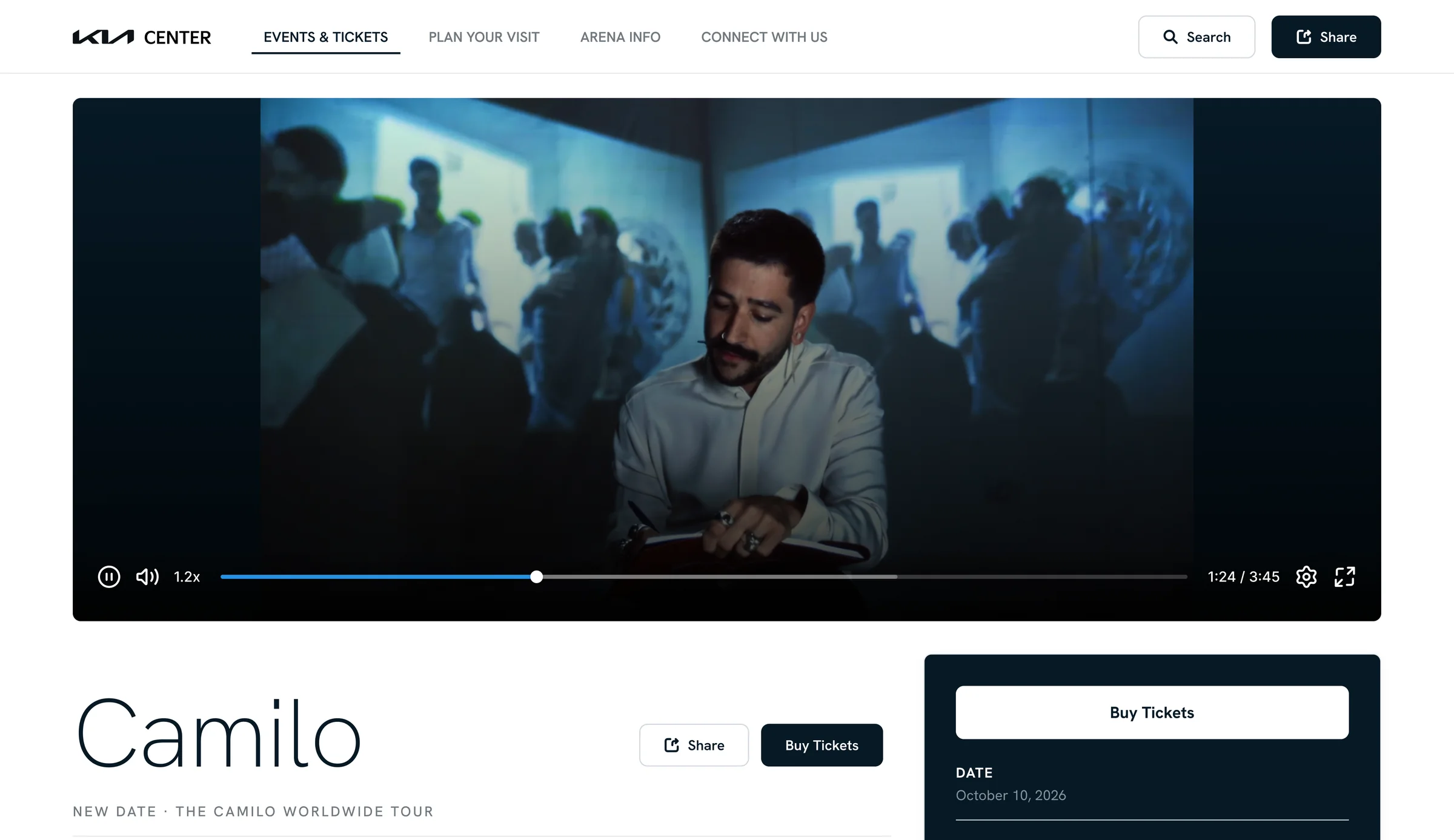
A short artist clip that plays on hover, to sell the night the way a photo can't.
A picture from the same official page an answer already cites.
Reflection
The hero is the page's largest, most emotional space, and today it's a still image.
A few seconds of crowd noise and lighting, playing only on hover with the still as its poster frame, sells the night in a way a photo can't.
Reflection
Cited text is accurate, but not always the fastest way to understand a place.
Bag policy, entry gates, and concession stands are easier to act on with a picture, pulled from the same official pages the answer already cites, so the image carries the same trust as the text.