
LinkedIn X Email

Hello there —

I'm Valentin, a Product Designer with roots in game development.

Based in Charlotte, NC.

My experience timeline
{{ activeYear }}
{{ activeTitle }}
{{ activeRole }}

Selected work

LeegB2B SaaSHR analytics

Leeg Workforce Intelligence

An enterprise HR tool that shows leadership where their workforce over-claims a skill, where it quietly outperforms, and what to do about either.
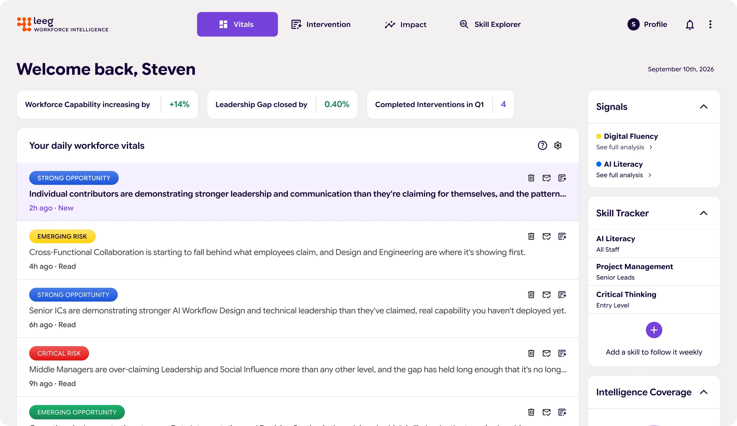

Leeg WI workforce vitals dashboard
Role
Product Designer
Timeline
5 weeks, Jun – Jul 2026
Team
India De Maio, Andy Sim
Tools
Figma, Claude Code, Google Stitch

My part. Secondary research, problem definition, and mid to high fidelity wireframes. I also led the visual craft phase.

66% → 89%
Task completion across two rounds of testing
3
HR leaders interviewed
6
Competitors analyzed

Problem

HR leaders can’t see the gap between what employees claim they can do and what they actually demonstrate.

The evidence is scattered across manager notes, review cycles, and gut instinct. When a gap threatens a strategic goal, or a hidden strength goes unnoticed, building the case for action means assembling it by hand.

Research

Leaders only trust workforce data when employees can answer honestly.

Three HR leader interviews, secondary research, and six competitors in workforce analytics came down to four insights.

01

Consistent communication

Leaders learn the most through frequent, direct contact, not the review cycle, and that only works when people are honest.

02

Honest data

Employees answer honestly only when data is aggregated and can’t be traced back to them.

03

Usability and integration

Leaders already run a full stack, and what they know is scattered across Slack, Jira, and notebooks. A new tool has to prove its value fast.

04

Strong career ecosystem

Leaders want people to own their growth. The same data should give employees a clearer picture and the organization a view of its skills.

Audience

Two people in HR leadership, with different jobs to do.

Meredith RyboltChief Human Resources Officer. Defends budget asks with data.
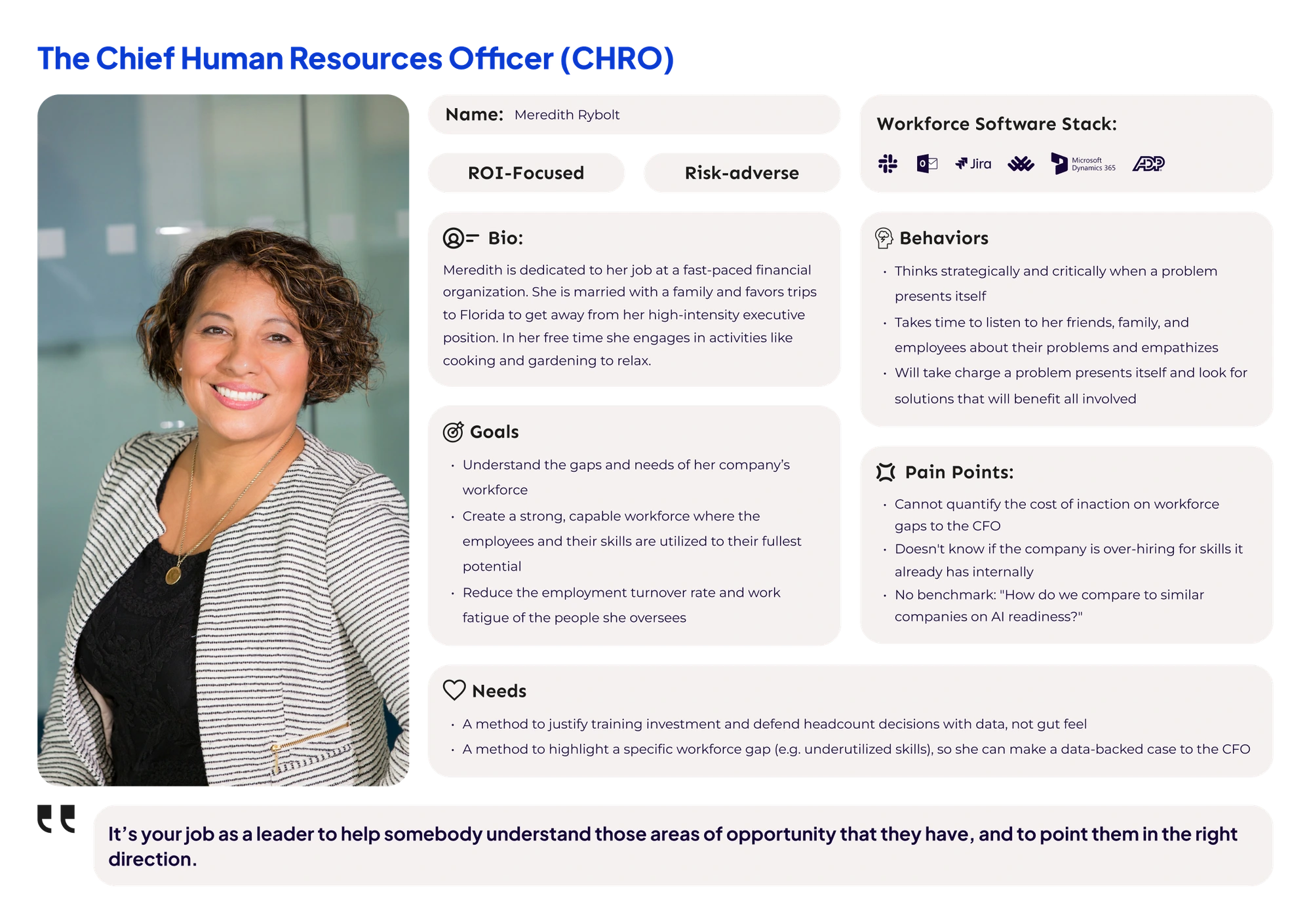
Persona: Meredith Rybolt, Chief Human Resources Officer

Tap the image to view full size

Steven AndersonPeople Business Partner. Catches workforce problems before they grow.
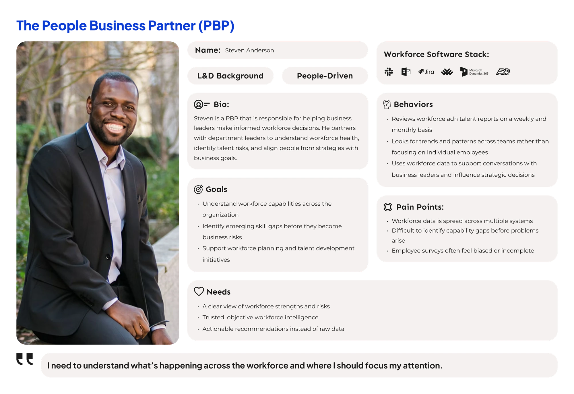
Persona: Steven Anderson, People Business Partner

Tap the image to view full size

Solution

A briefing, not a dashboard.

Leeg WI reports conclusions instead of numbers. It measures the gap between what a workforce claims and what it demonstrates, holds that gap against the organization’s goals, and names the ones at risk. Hidden strengths surface the same way.

Feature 01

Workforce Vitals

The weekly read on what’s moving. Risks and hidden strengths surface before anyone goes looking.

{{ leegVitalsAlt }}

Feature 02

Workforce Interventions

Where an insight becomes a plan with an owner, a timeline, and the evidence behind it.

{{ leegInterventionAlt }}

Feature 03

Skill Explorer

Searchable skills data that adds credibility to an intervention.
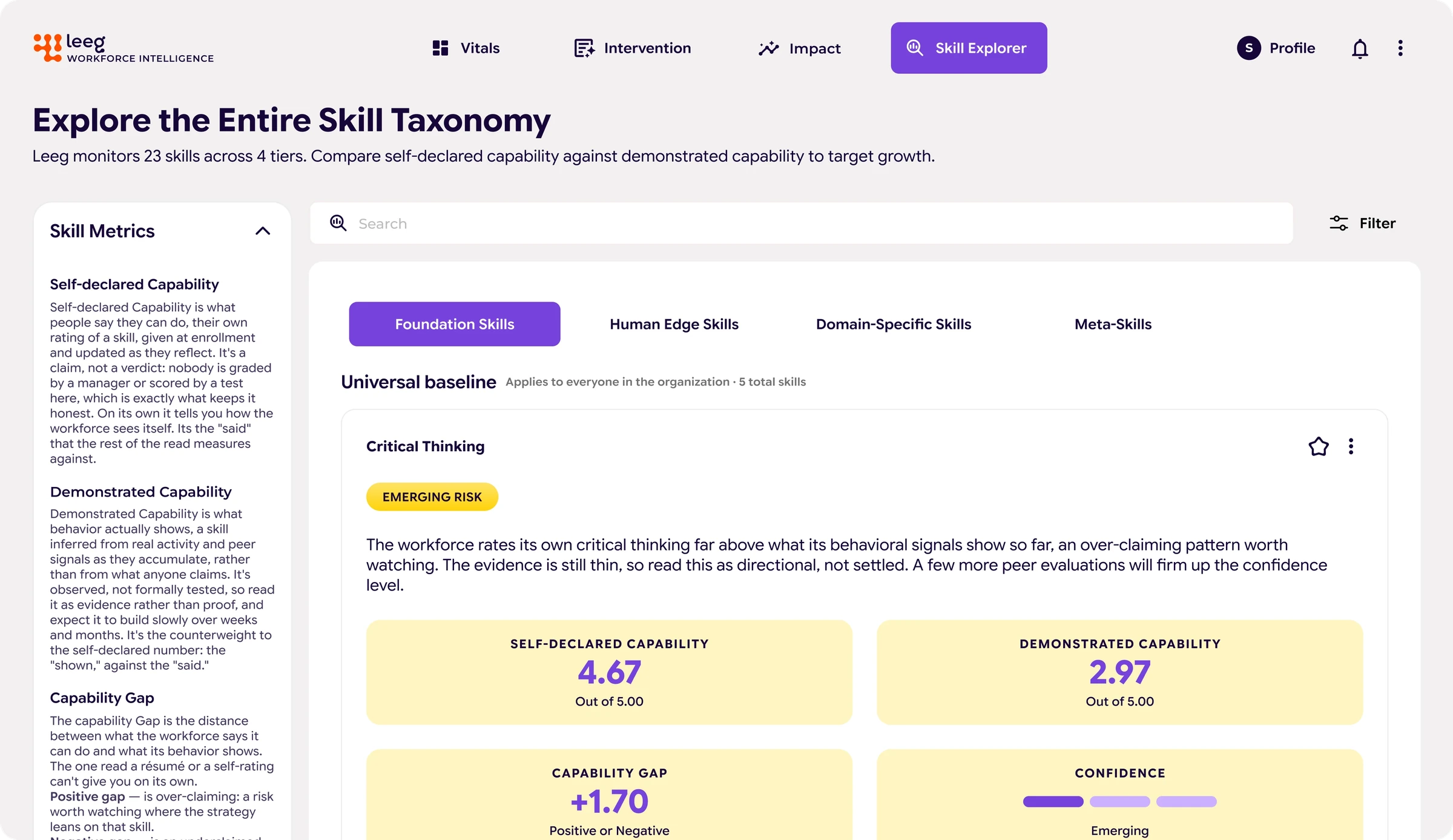
Workforce Skills Overview comparing self-declared and demonstrated capability

Feature 04

Workforce Impact

The organization-wide view, with custom benchmarks and exportable reports.
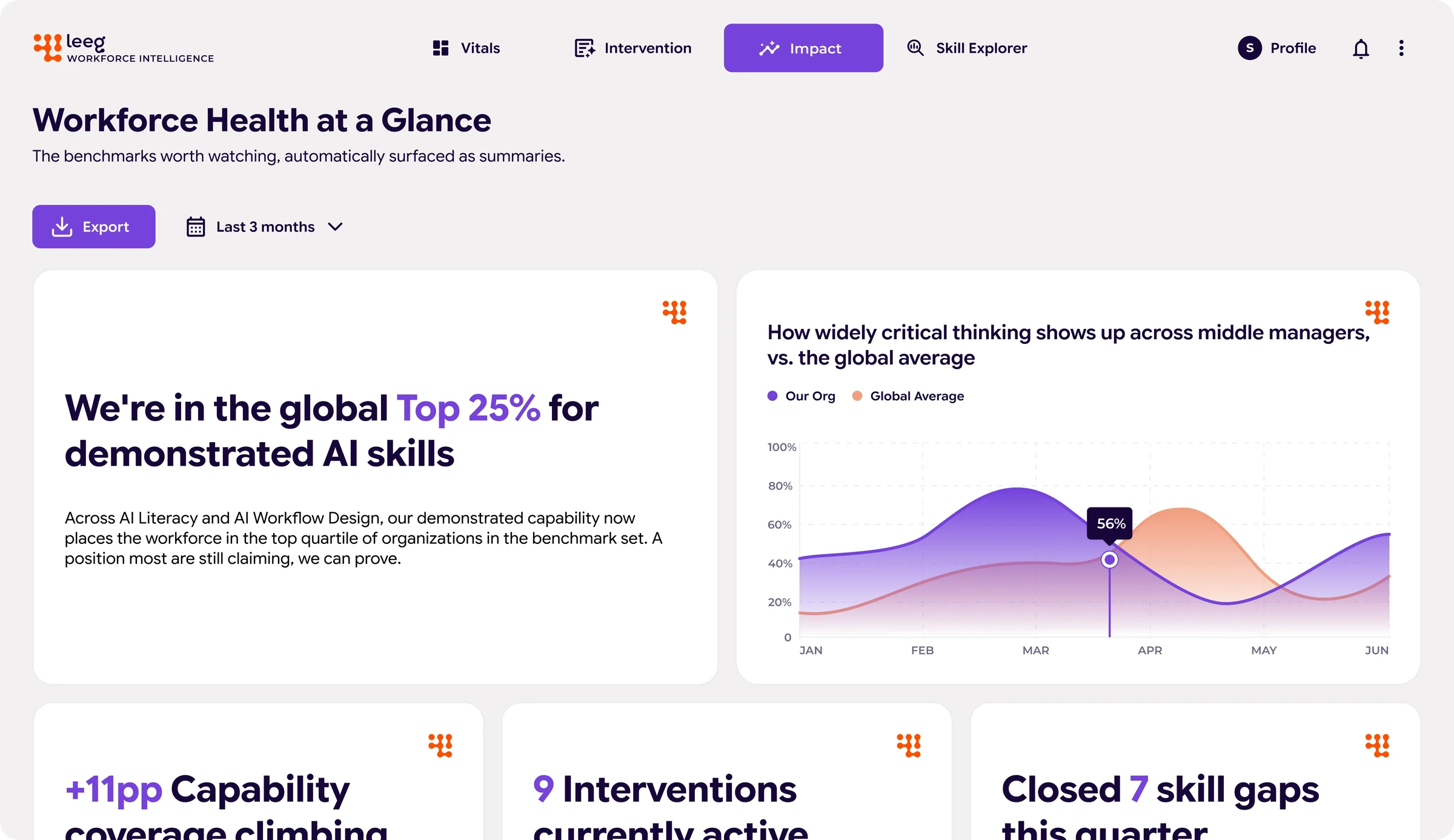
Workforce Health at a Glance: benchmarks, trend chart, and quarterly summary stats

Reflection

Testing changed the product more than any single design decision did.

Two rounds of user testing took task completion from 66% to 89%, and the fixes behind that were plain ones: reworked navigation, and every core metric renamed to match the language HR leaders already use. A clear label can do more for a user than a new feature.

I also explored a dark mode for the product.The Vitals screen on a dark surface

HR leaders check workforce data daily, so I tested how the layout and the purple accent hold up in the dark. The status badges had to survive the switch: Strong Opportunity, Emerging Risk, and Critical Risk each carry meaning, so they must stay distinct at a glance.
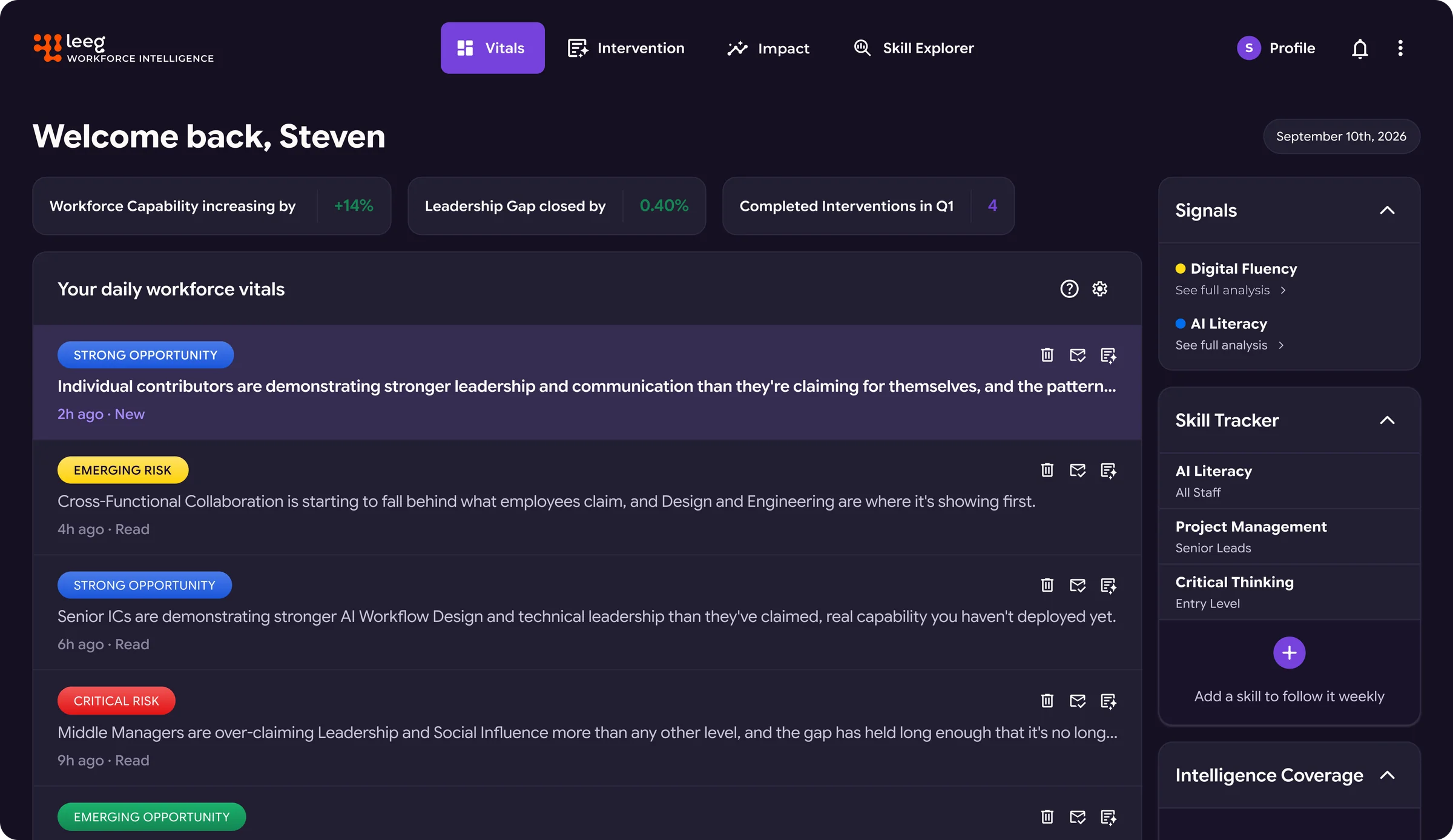
Leeg Workforce Vitals screen in dark mode

Tap the image to view full size
Kia CenterVenue websiteDesigned and built solo

Kia Center: Creating a Better Customer Experience

Fans find shows on social media and buy tickets on Ticketmaster, so they tend to skip the venue’s site. I improved the customer experience by designing smart search and an interactive parking map.

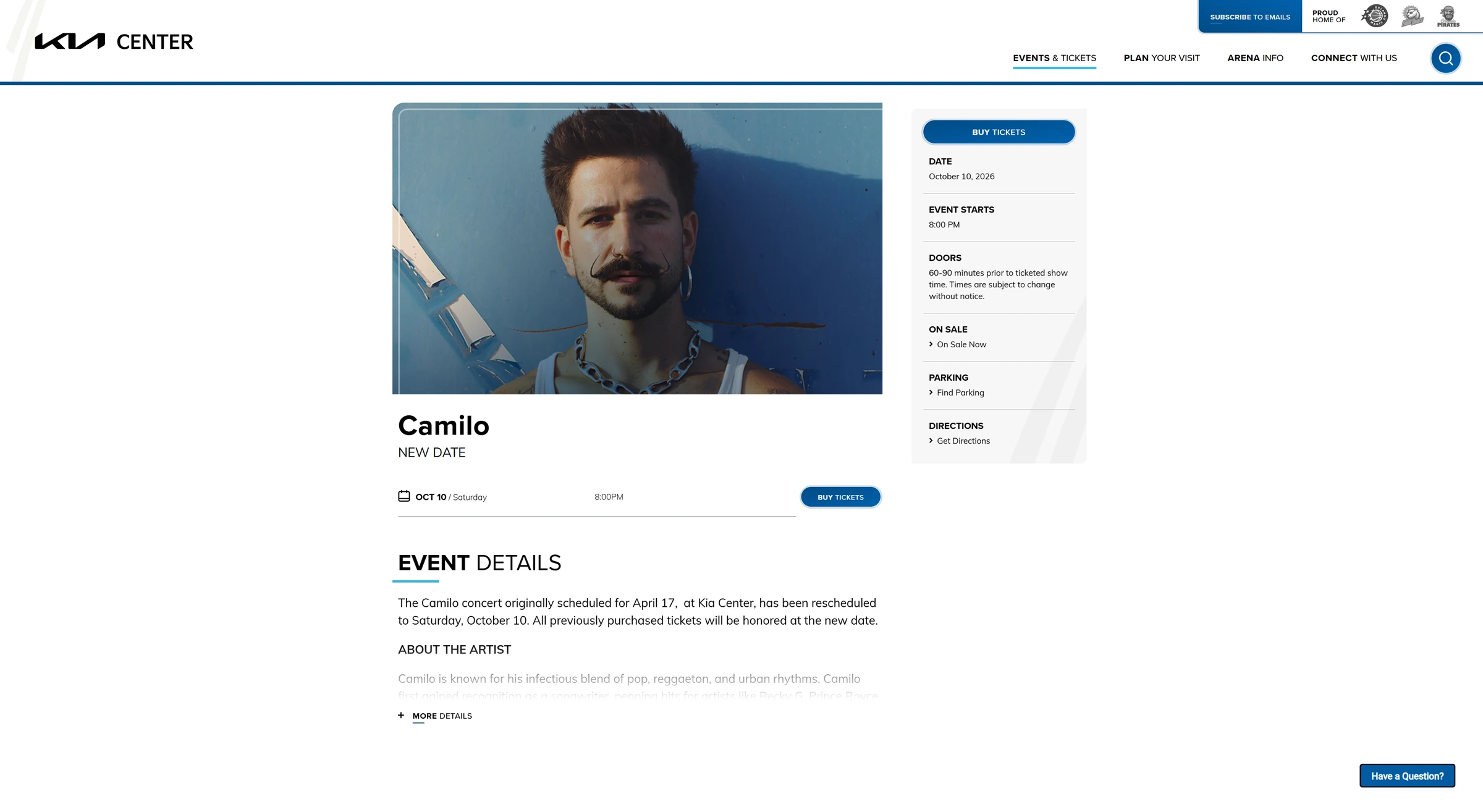
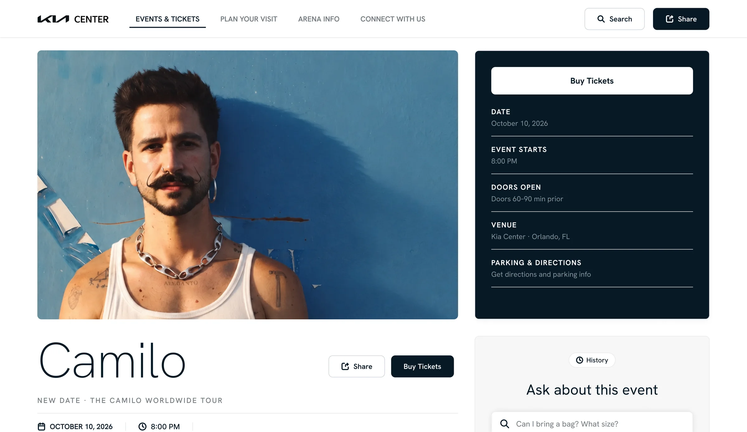
Redesigned Kia Center event page for the Camilo show
Role
Product Designer
Timeline
3 week sprint
Team
Solo
Tools
Figma, Claude Code, GitHub, Vercel

My part. End to end: research, brand exploration, wireframes, high fidelity design, then building and deploying the prototype myself.

5
Research findings, each traced to a business problem
4
Products studied before sketching
2
Features designed, built, and deployed

Problem

Venue websites have been pushed to the edges of the fan’s buying journey.

Fans find shows on social media, buy tickets on Ticketmaster, and increasingly get planning answers from AI search summaries that draw on the venue’s own content. What’s left for the venue site is a reference page people check for the bag policy. That does little for the revenue venues depend on, like parking, premium seating, food and beverage, and sponsorships.

The original Kia Center event page for the Camilo show
The original event page
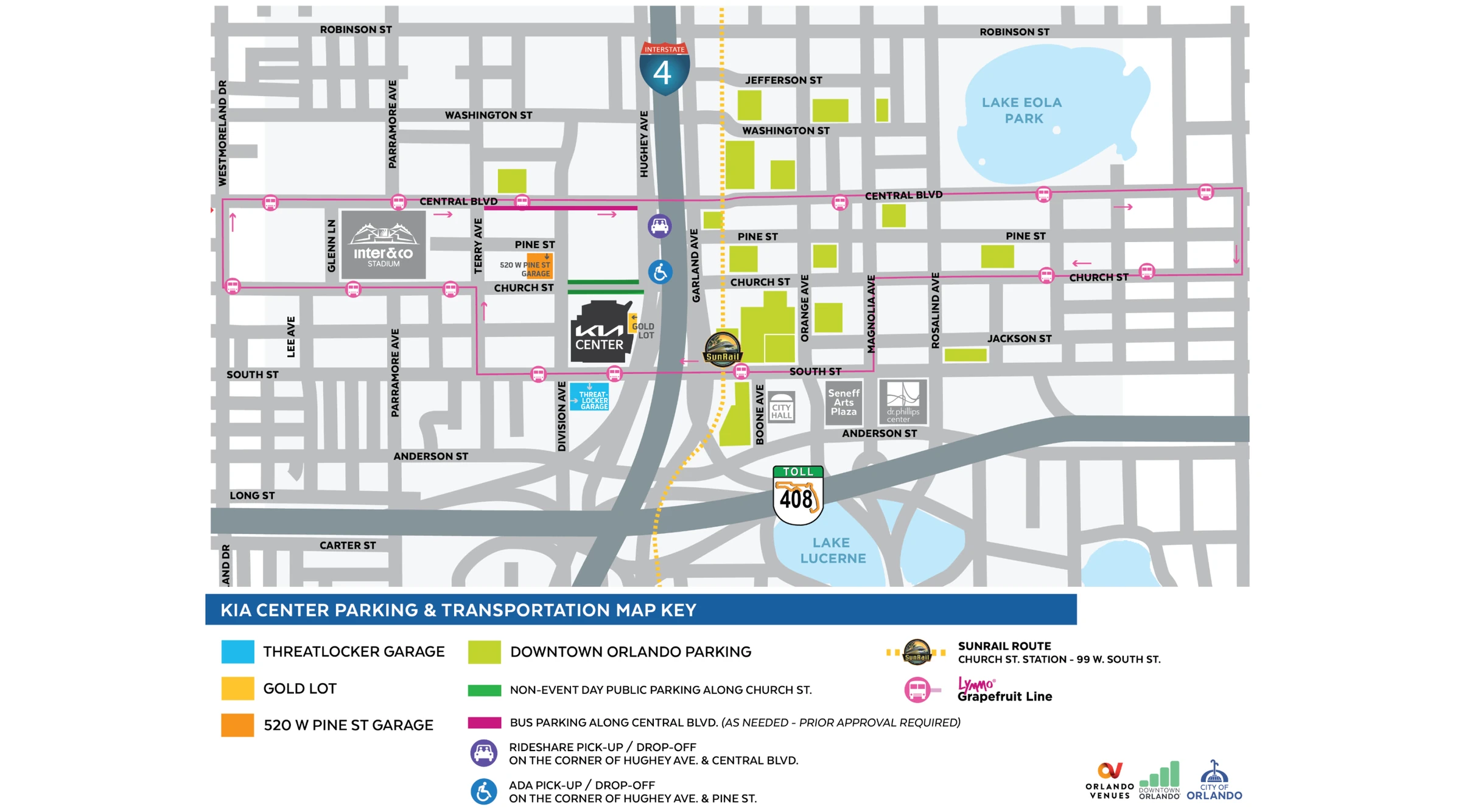
The original Kia Center parking and transportation map, a static graphic
The original parking map, a static graphic

Research

Why are venue sites being left out of the customer shopping experience?

Venue sites get left out of the shopping path because each step that matters commercially happens somewhere else. I traced five findings to the business problem each one creates, then to the features that could answer it. Two made the cut for a three-week sprint.

Research findingBusiness problemPotential features
01Discovery happens elsewhere48% of superfans first heard about events on social media. Word of mouth reached 22%, twice the 11% who heard directly from organizers.Source: Eventbrite, Australian music fans When fans discover shows elsewhere, venues struggle to grow an audience they own, like a mailing list, which makes premium site features a harder sell.
  • Artist alertsFans follow an artist or genre and get notified when a show is booked at the venue.
02The ticket isn’t where venues make moneyThe biggest revenue line after tickets: sponsorships and suites at MSG Entertainment (about 27% of revenue), building rentals at the Orange County Convention Center (26%), and lease revenue at U.S. Bank Stadium (18%).Source: MSG Entertainment 10-K, 2025, Orange County Comptroller, MSFA ACFR, FY2024 Sites built around the ticket handoff do little for the venue’s higher-margin revenue, like parking, premium seating and F&B. Clients see a small return and less reason to keep investing in the site.
  • Sponsored placementsTies sponsors to useful features, like a parking map presented by a partner, which creates inventory the venue can sell.
  • Smart searchDesignedAnswers fan questions and surfaces parking, upgrades and food options in the results.
03Accessibility rules are making venue sites machine-readableVenue sites are being pushed by law to become easier to read, and that work also makes them easier for AI tools to read. Since the 2008 rewrite, every version of WCAG has added rules, growing from 61 to 78 to 86.Source: W3C, WCAG 2.2, DOJ rule, April 2026 Meeting WCAG protects clients from lawsuits, but the same structured content lets search engines and AI tools answer fans without a site visit. Traffic drops, and client marketing teams notice.
  • Interactive parking and venue mapDesignedReplaces static PDFs with an accessible map that fans have to open the site to use.
  • Interactive seating mapShows the view from each section, which a search result can’t replicate.
04Limited sharing options are mostly a security choiceBad bots grew from 27% of all web traffic in 2021 to 40% in 2025. Ticketmaster ties transfers to its app, with barcodes that refresh every 15 seconds so screenshots can’t be resold.Source: Imperva, Bad Bot Report 2026 Without safe ways to share, event pages don’t spread. That lowers the value of the event publishing tools clients pay for.
  • Official source badgeMarks the venue site and anything shared from it as official, and points fans only to authorized sellers.
05Planning happens in searchWhen Google showed an AI summary, people clicked a result only 8% of the time, compared with 15% when it didn’t, and just 1% clicked a link inside the summary.Source: Pew Research Center, 2025 Over time, the venue loses control of its own information. Outdated bag rules or parking details turn into guest services calls and frustrated fans at the gate.
  • Day-of modeSwitches the event page to doors, gates, parking status and live alerts in the final 24 hours.
  • Day-of guide opt-inSends fans a reminder with everything they need on show day and grows the venue’s contact list along the way.

Branding

A page that looks like Kia.

I studied Kia’s own product and brand pages and the Kia Center logo lockups, then distilled them into a four color palette for the rebuild.

Midnight Navy
#05141F
Primary dark elements
Steel Gray
#70797F
Secondary text & muted
Silver Mist
#D2D2D3
Borders, dividers & subtle fills
Cloud White
#EBECED
Page backgrounds & cards

Feature Explorations

Four products had already solved a piece of this.

Two for answering a question in context, two for helping people find their way around a place.

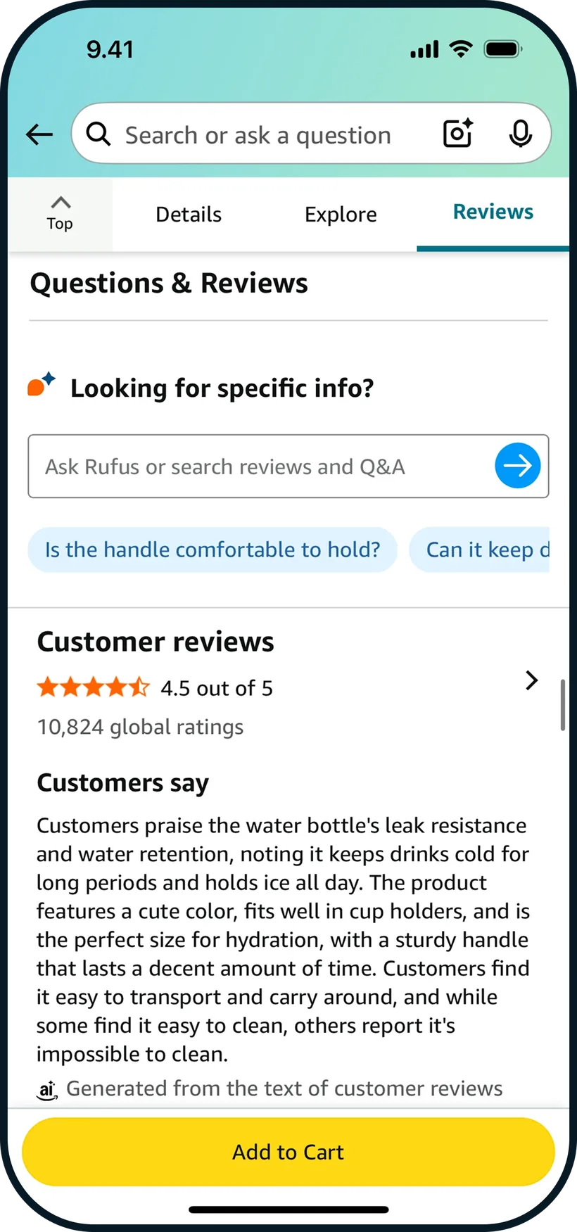
Amazon app screen studied during feature exploration
Amazon

Ask Rufus sits on the product page with tappable questions like “Is the handle comfortable to hold?”

Took: Suggested question chips, so users see what to ask.

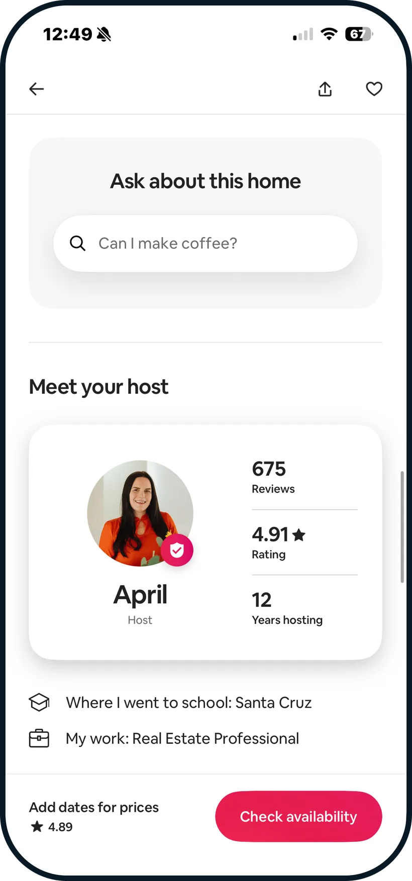
Airbnb (mobile) app screen studied during feature exploration
Airbnb (mobile)

“Ask about this home” lives on the listing and only answers about that home.

Took: A page-scoped search with a real question as the placeholder.

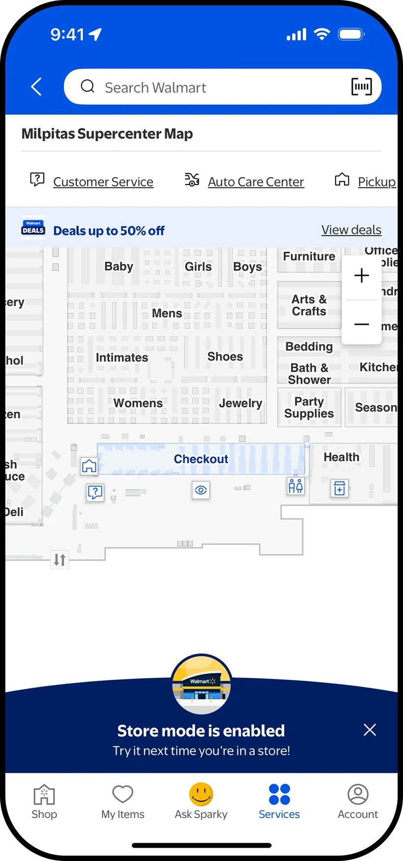
Walmart app store map studied during feature exploration
Walmart

The store map lives inside the app, with departments, Customer Service, Pickup, and Checkout labeled, plus zoom controls.

Took: Label the services people look for right on the map.

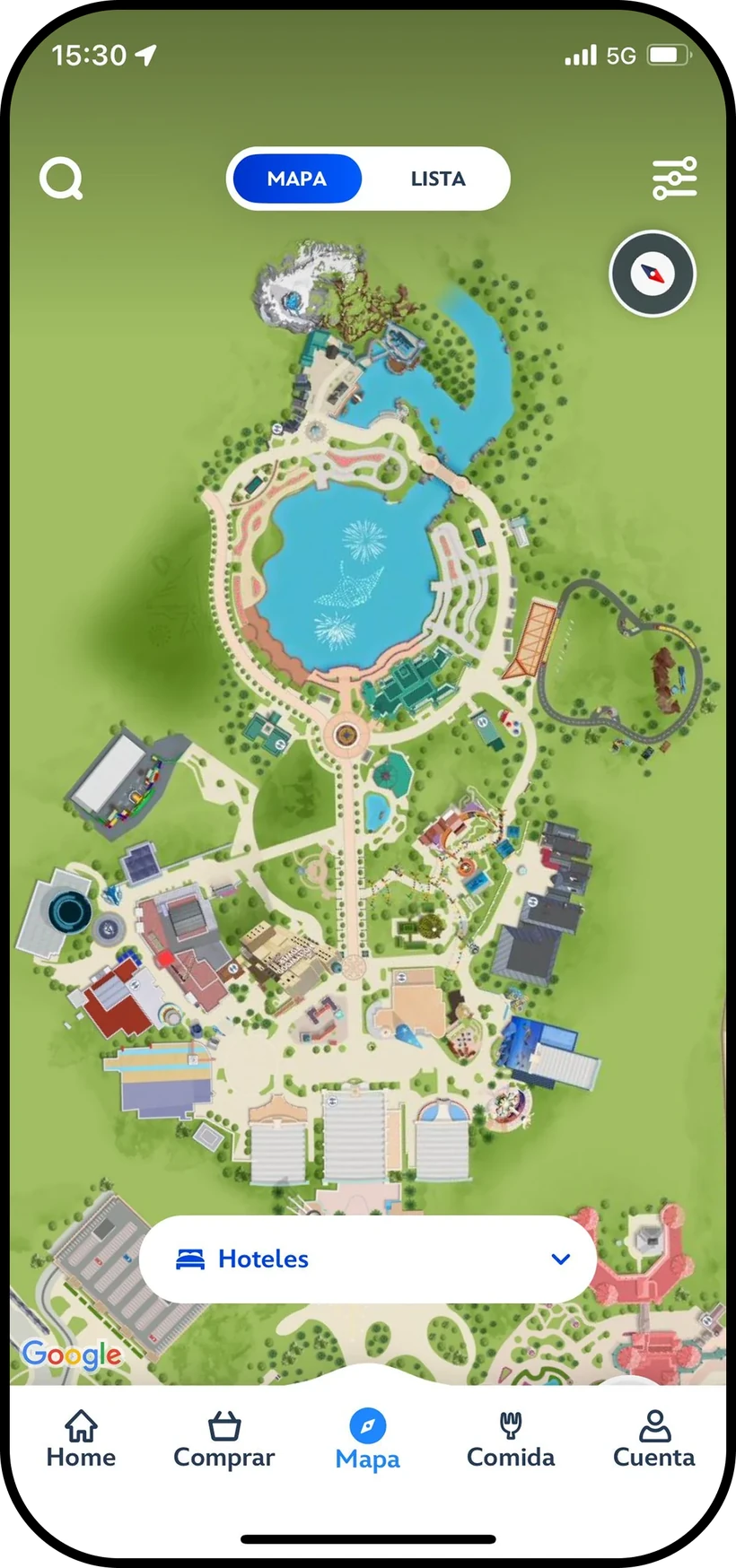
Disneyland app park map studied during feature exploration
Disneyland

An illustrated park map with a Map and List toggle and a category picker, like Hotels, to narrow what’s shown.

Took: Filter the map by category, with a list view of the same places.

Solution

How might we make the venue site the most useful and trusted place to plan a visit, so that traffic turns into revenue the venue can measure?

Feature 01

Smart Search

Answers fan questions right on the event page with exact quotes from official venue pages and a link to each source, so planning happens on the venue’s site instead of in a search summary.

{{ kiaSearchAlt }}

Feature 02

Interactive Parking Map

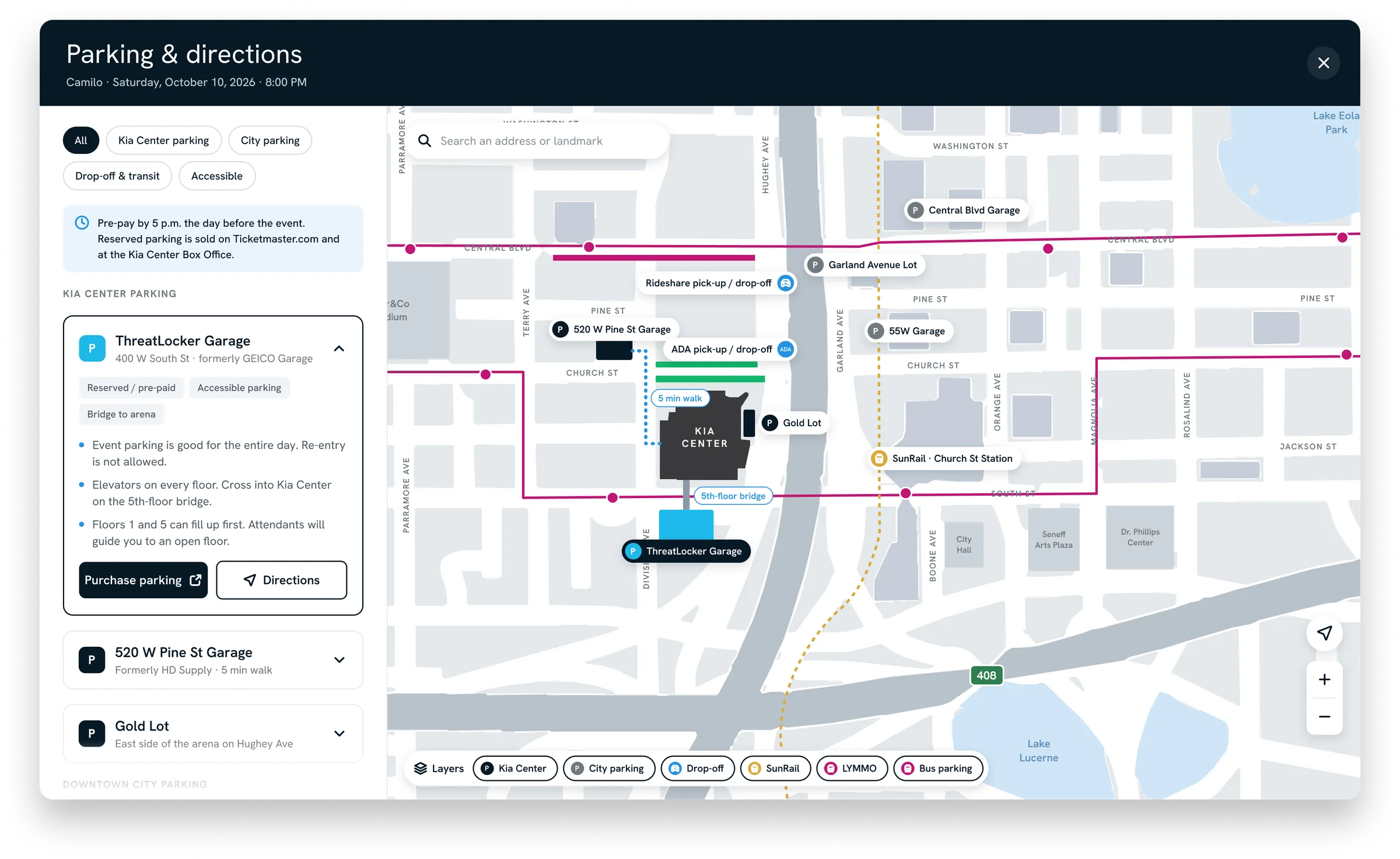
Replaces the static parking graphic with a map that opens from the event page. Venue garages, city lots, drop-off, transit, and accessible options sit in one place, each with directions and a link to pre-pay, so fans plan their arrival on the venue’s site.

Parking and directions modal with filters, garage details, a pre-pay link, and an interactive map of the area around Kia Center

Reflection

Three weeks was the right amount of pressure.

Working against a real, public site meant the problems were there to be found, not invented. A short sprint forced me to pick the two features that mattered most, and building it myself meant every decision had to survive a real browser. Here’s what I’d build next.

Video in the hero slot.A hover-to-play clip, with the still as the poster frame

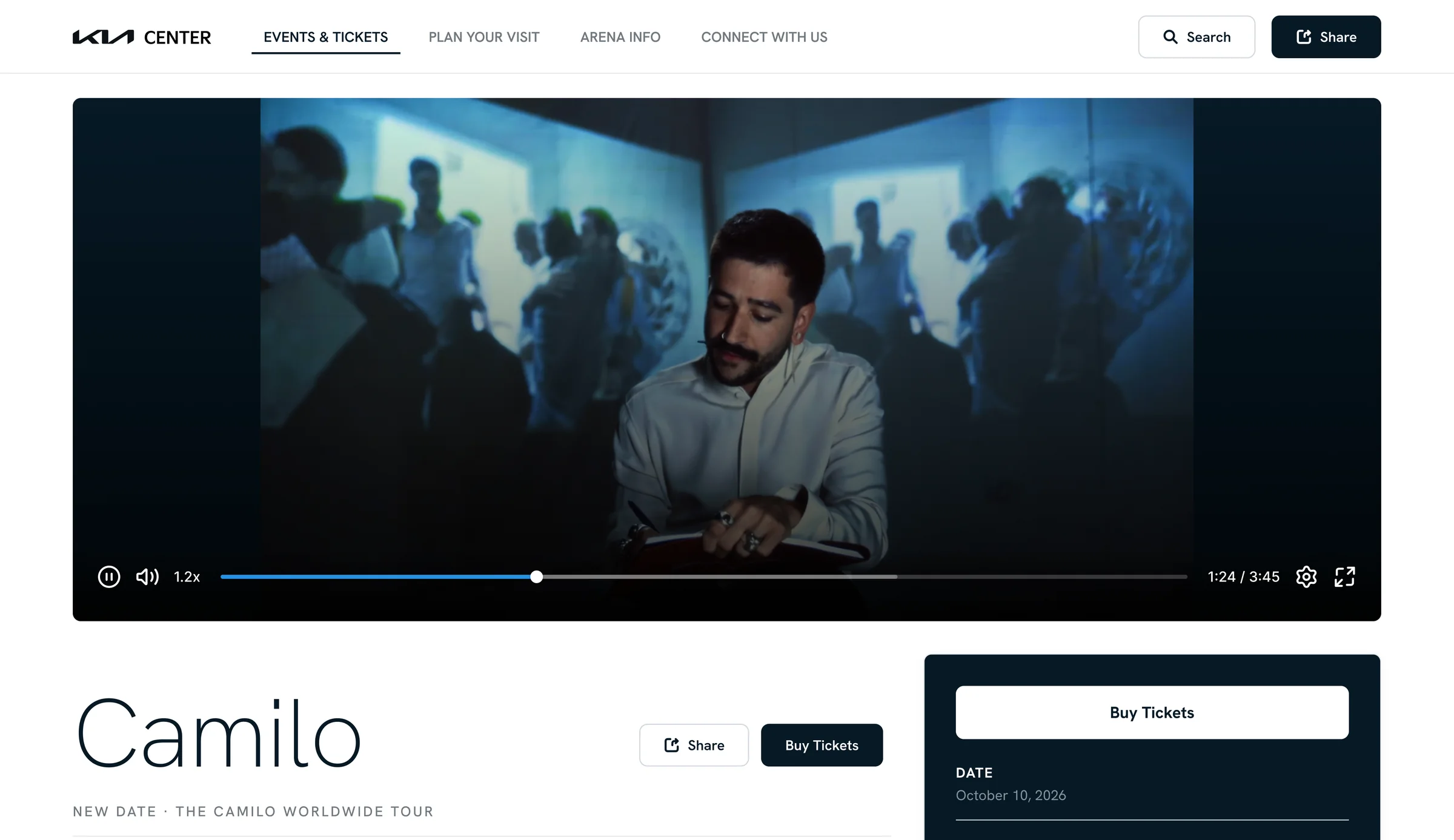
The hero is the page’s largest, most emotional space, and today it’s a still image. A few seconds of crowd noise and lighting, playing only on hover, sells the night in a way a photo can’t.

Mockup of the Kia Center event page with a video playing in the hero slot

Tap the image to view full size
Images inside the smart search results.An answer with a picture from the official venue page

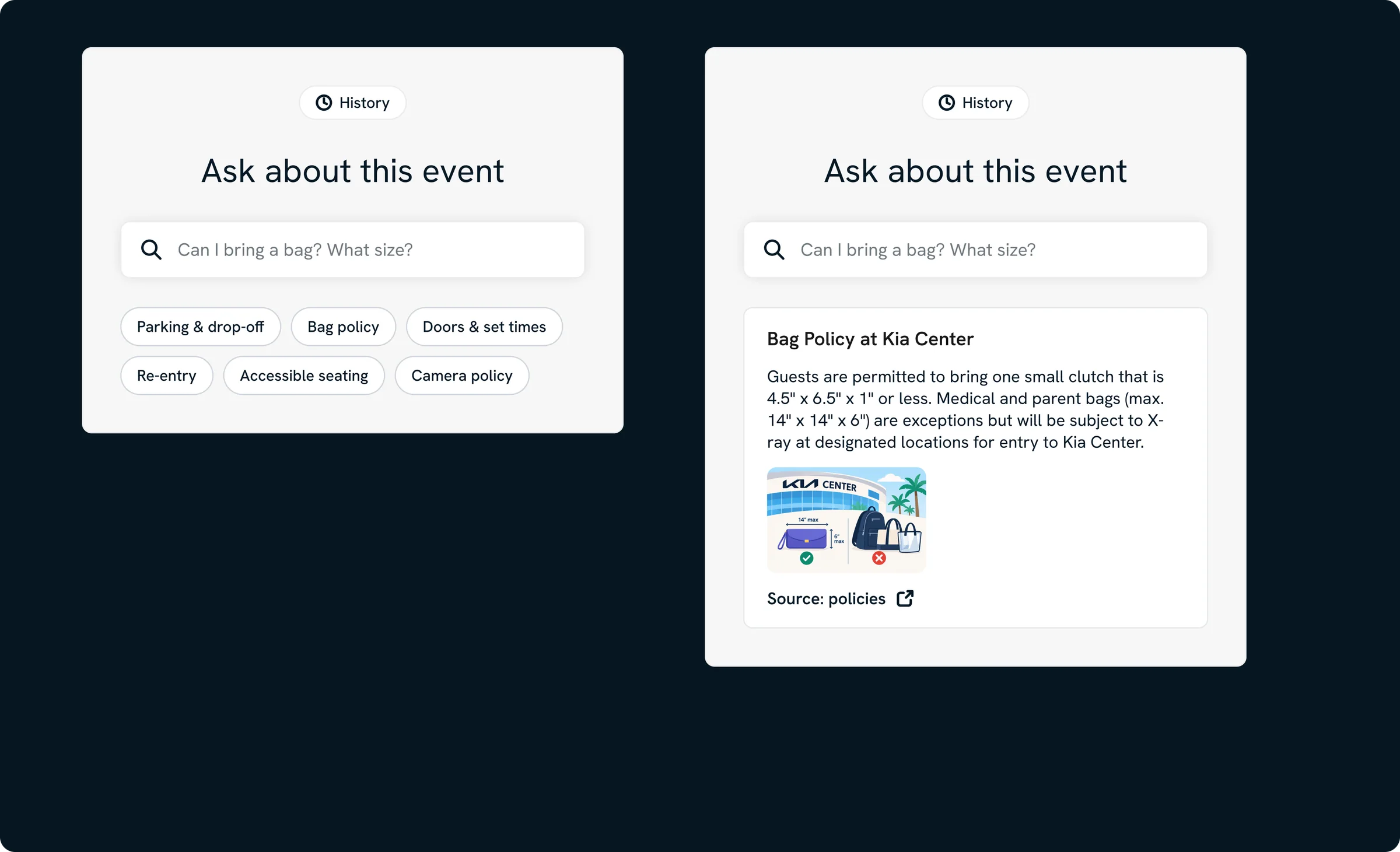
Cited text is accurate but not always the fastest way to understand a place. Bag policy, entry gates, and concession stands are easier to act on with a picture, pulled from the same official pages the answer already cites.

Smart search prototype showing a bag policy answer with an image from the official venue page attached

Tap the image to view full size
M1 FinanceFintechConcept project

M1 Goals

A goal-based investing feature for M1 Finance that replaces vague anxiety about the future with a plan young investors can see progress on.

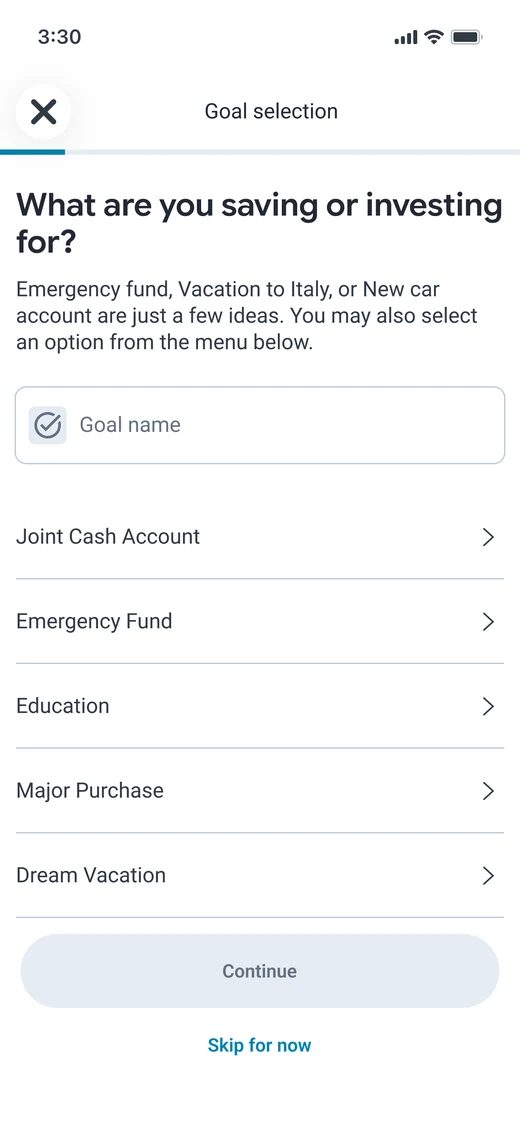
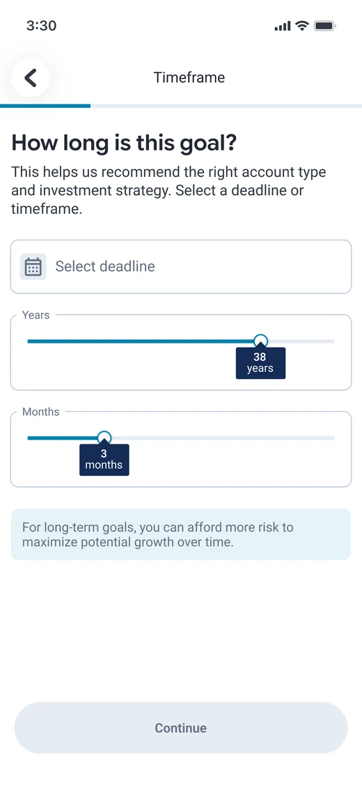
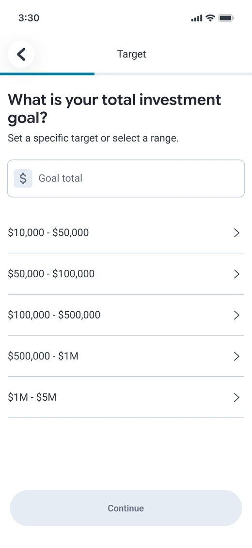
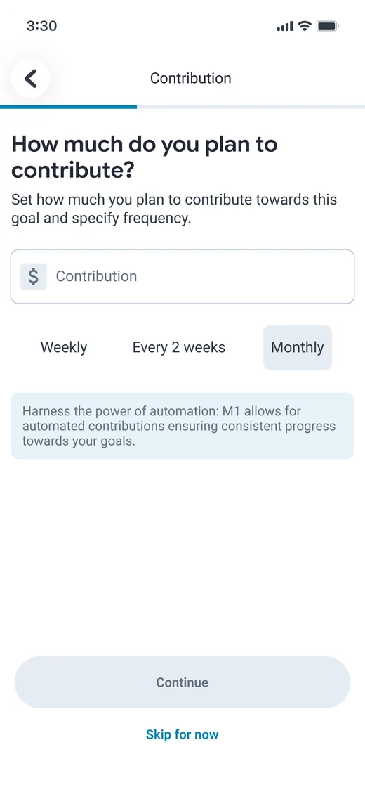
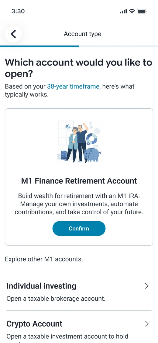
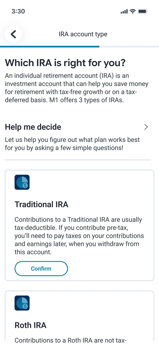
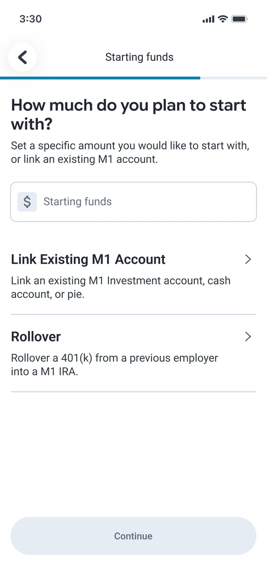
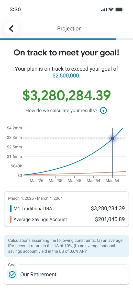
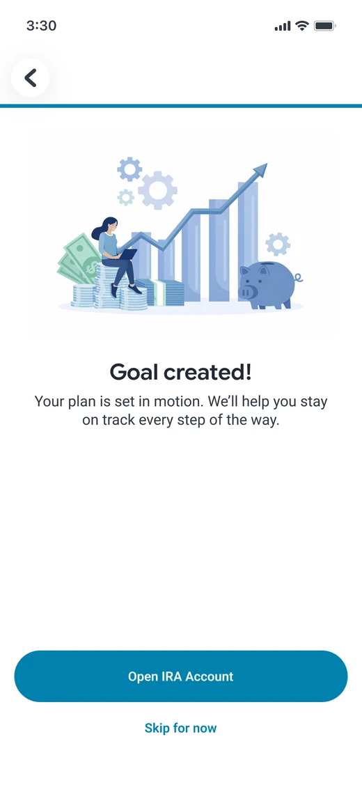
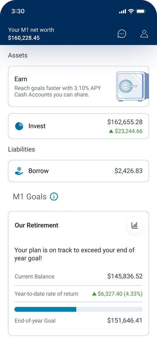
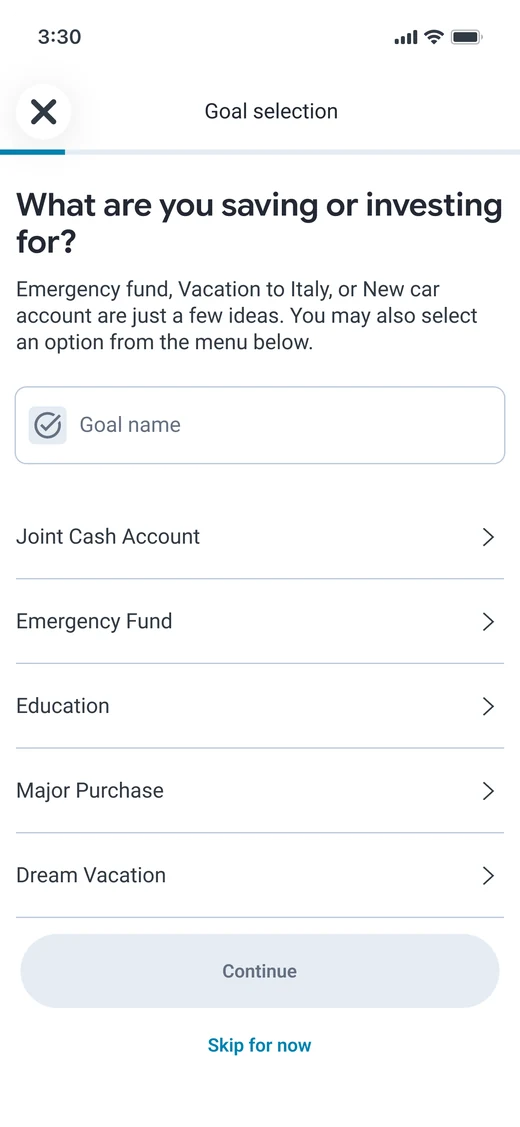
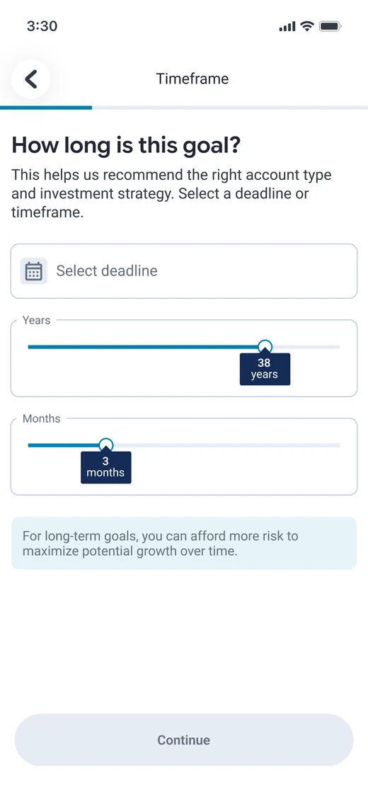
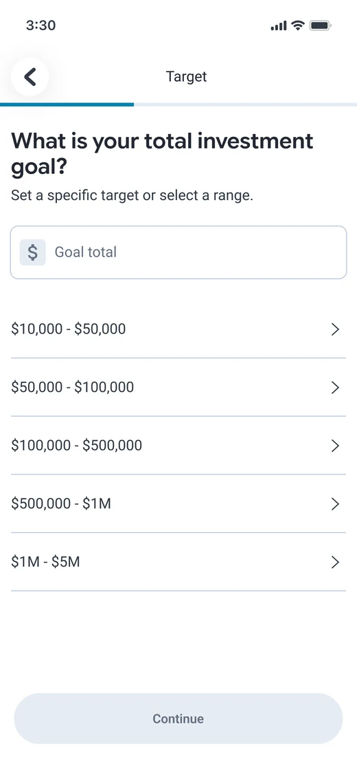
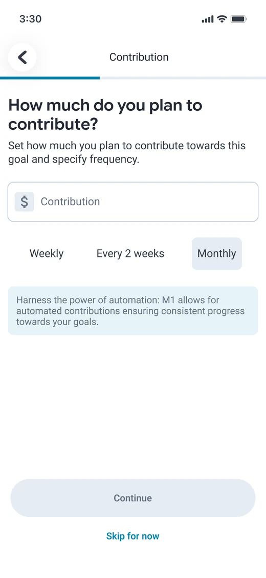
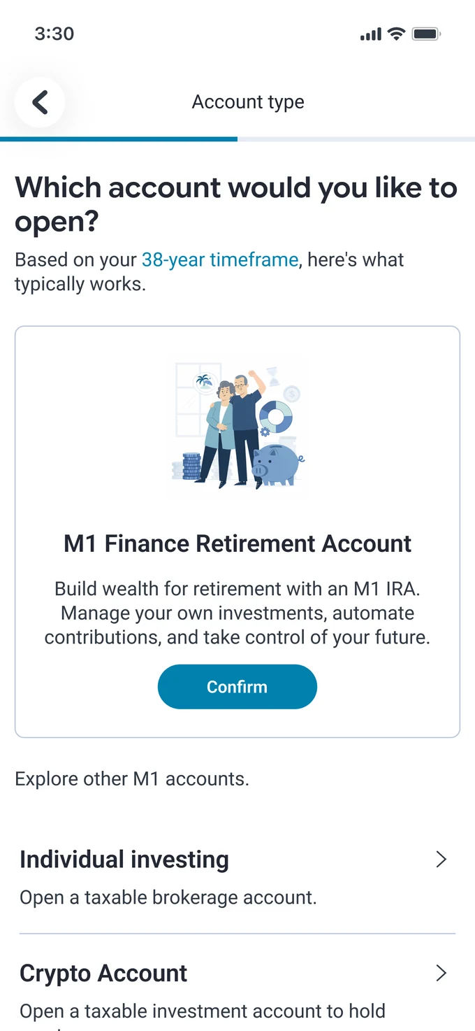
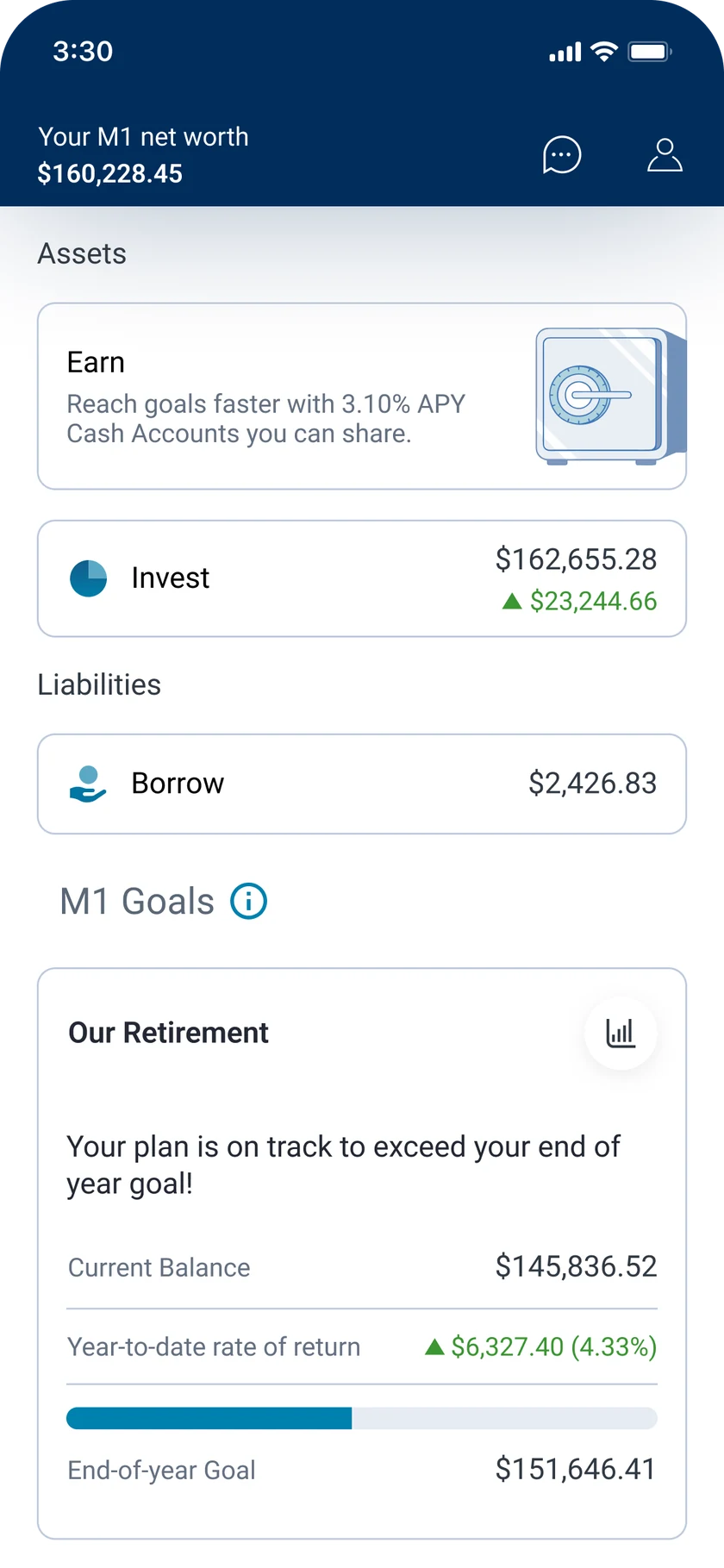
M1 home dashboard before setting a goal Goal selection screen Timeframe screen Target screen Contribution screen Account type screen IRA account type screen Starting funds screen Projection screen Goal created success screen Home dashboard with the new goal
Role
Product Designer
Timeline
5–6 weeks
Team
Solo
Tools
Figma, Figma Make, Claude, Stitch

My part. Research, flows, and high fidelity design for a self-directed concept, not affiliated with M1 Finance.

6
User interview sessions
4
Competitors benchmarked
9
Steps in the guided goal flow

Problem

M1 automates investing, but can’t tell users whether any of it is working toward something real.

Wealthfront and Betterment already lean into guided planning. Without it, M1 risks losing the users who open the app just to check they haven’t lost money, and who want some reassurance alongside the automation.

Research

Progress only feels real when it’s tied to a life goal.

An audit of M1, a benchmark against competitors, and six interview sessions shaped three insights.

01

Progress is emotional before it’s financial

A number tied to a home down payment felt like progress. The same number next to a ticker felt like noise.

02

Uncertainty spikes after decisions

Anxiety surged after big financial decisions and market drops, not during daily checks, so the feature has to show up at those moments.

03

Guidance without crossing into advice

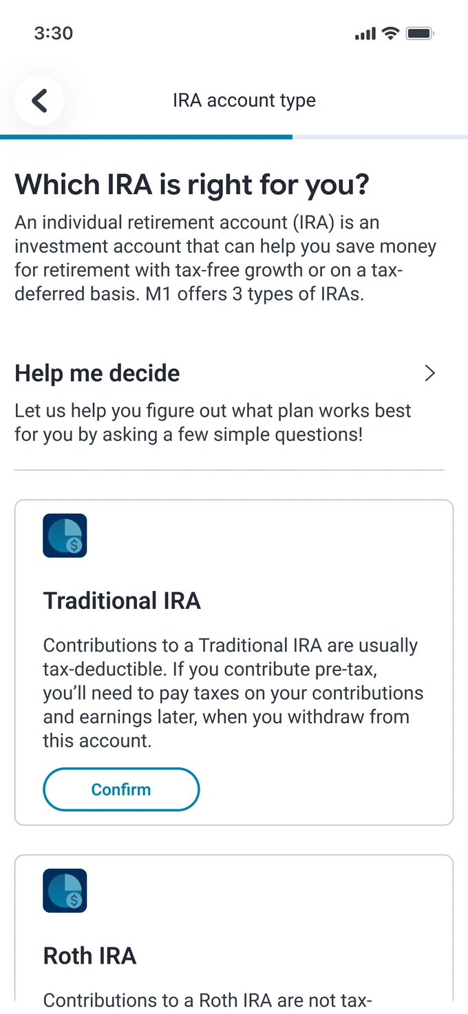
Everyone wanted help with choices like IRA types, but M1 can’t advise. The flow breaks the decision down instead of making it.

Audience

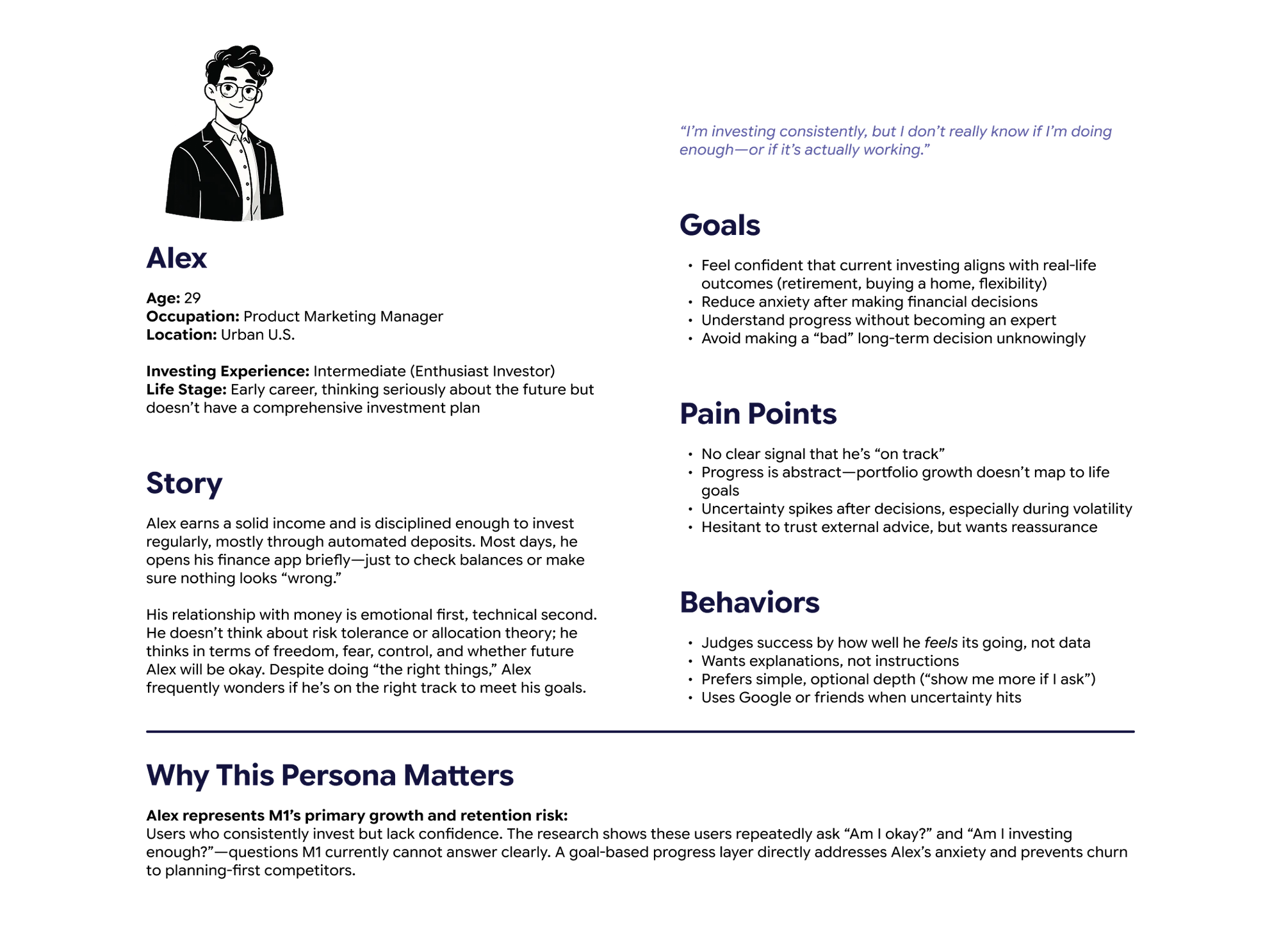
Someone who invests consistently, with no way to tell if it’s enough.

Alex29, Product Marketing Manager. Intermediate investor.
Persona: Alex, 29, Product Marketing Manager, intermediate investor

Tap the image to view full size
Solution

Track progress against the goal, not the market.

Users set a goal, then make each decision behind it: account type, contribution, timeframe. Education lives inside the flow, so confidence grows without M1 stepping into a fiduciary role, and “am I on track?” finally has a real answer.

Feature 01

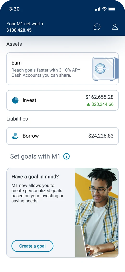
Goal tracking on the home dashboard

The first thing users see after setting a goal: progress toward something specific, not just a portfolio balance.

Home dashboard with the Our Retirement goal card

Feature 02

Guided goal creation

Nine small decisions instead of one overwhelming form, turning a vague savings intention into a trackable goal.

Goal selection screen

1. Goal selection

Timeframe screen

2. Timeframe

Target screen

3. Target

Contribution screen

4. Contribution

Feature 03

Account guidance, without the advice

Plain language and a preselected card walk users through Traditional versus Roth without M1 telling them what to pick.

Account type screen recommending an M1 Finance Retirement Account IRA account type screen comparing Traditional, Roth, and SEP

Feature 04

Growth projection

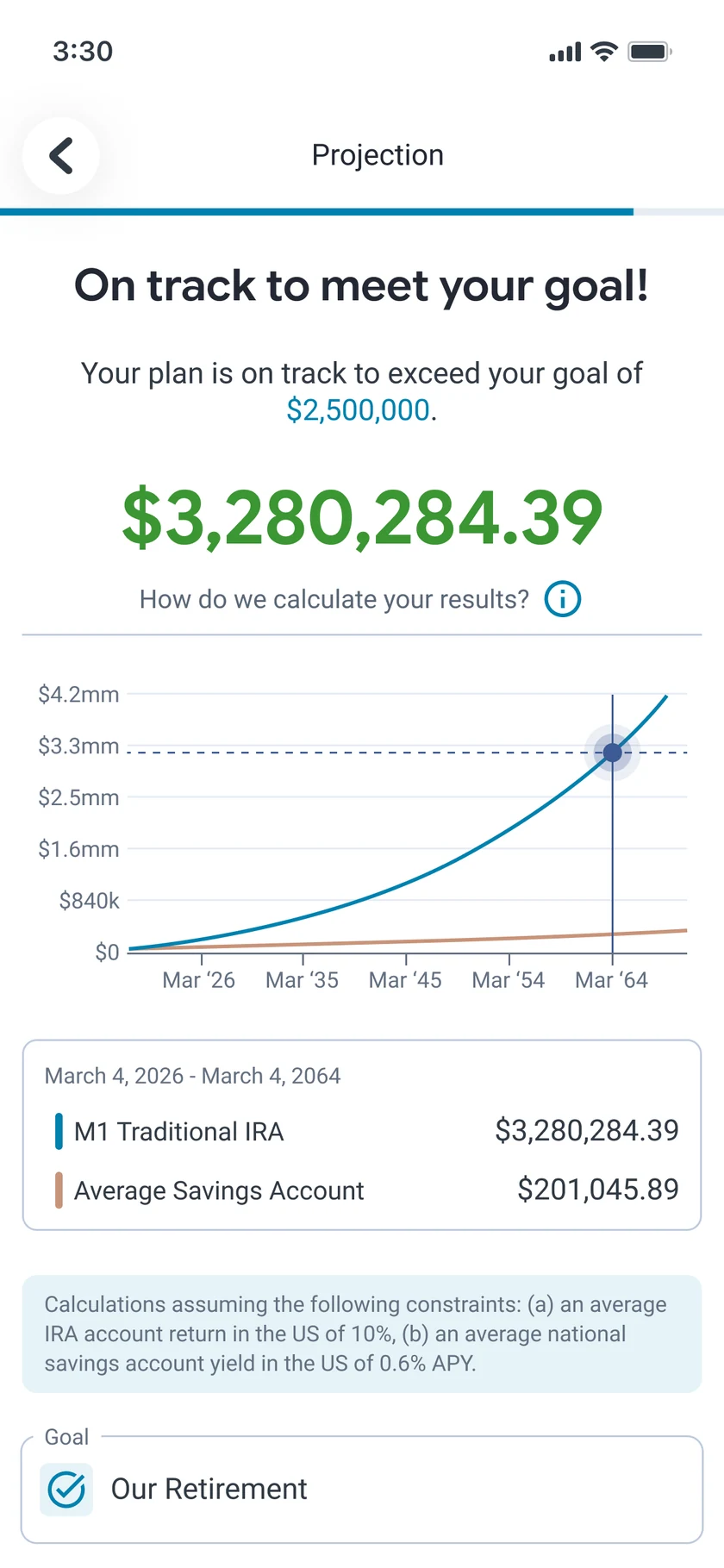
An interactive graph shows what today’s contribution becomes, compared against a standard savings account.

Projection screen with growth chart and savings account comparison

MeuusMobile appDesigned and built solo

Meuus

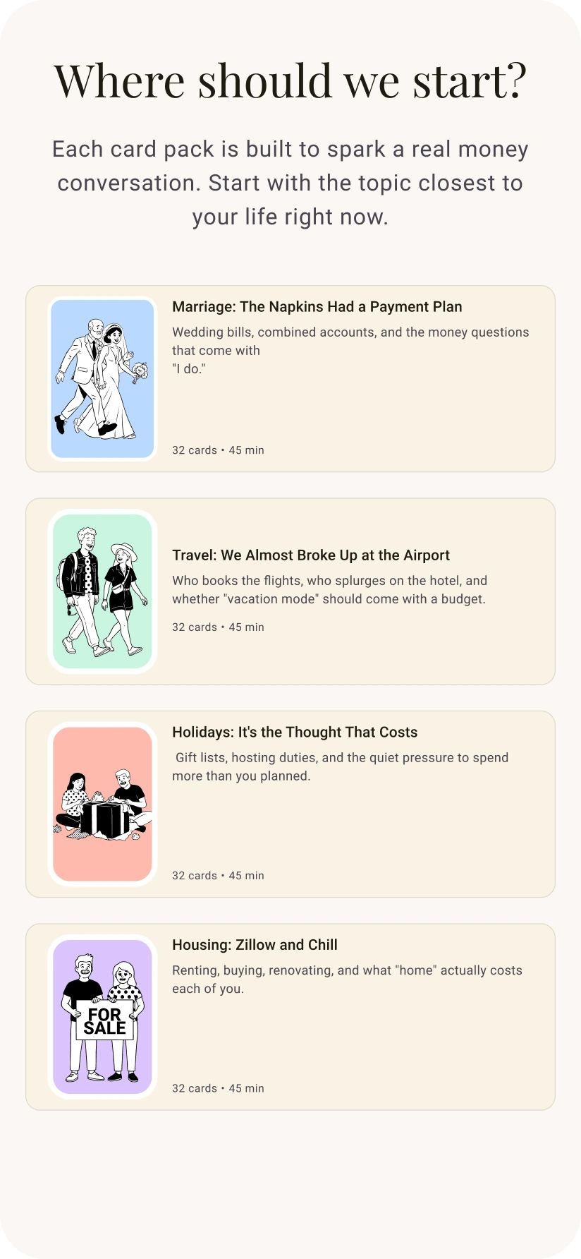
A card game that helps couples talk about money. Partners answer prompts with emotions instead of numbers, then see the money personality behind their answers.

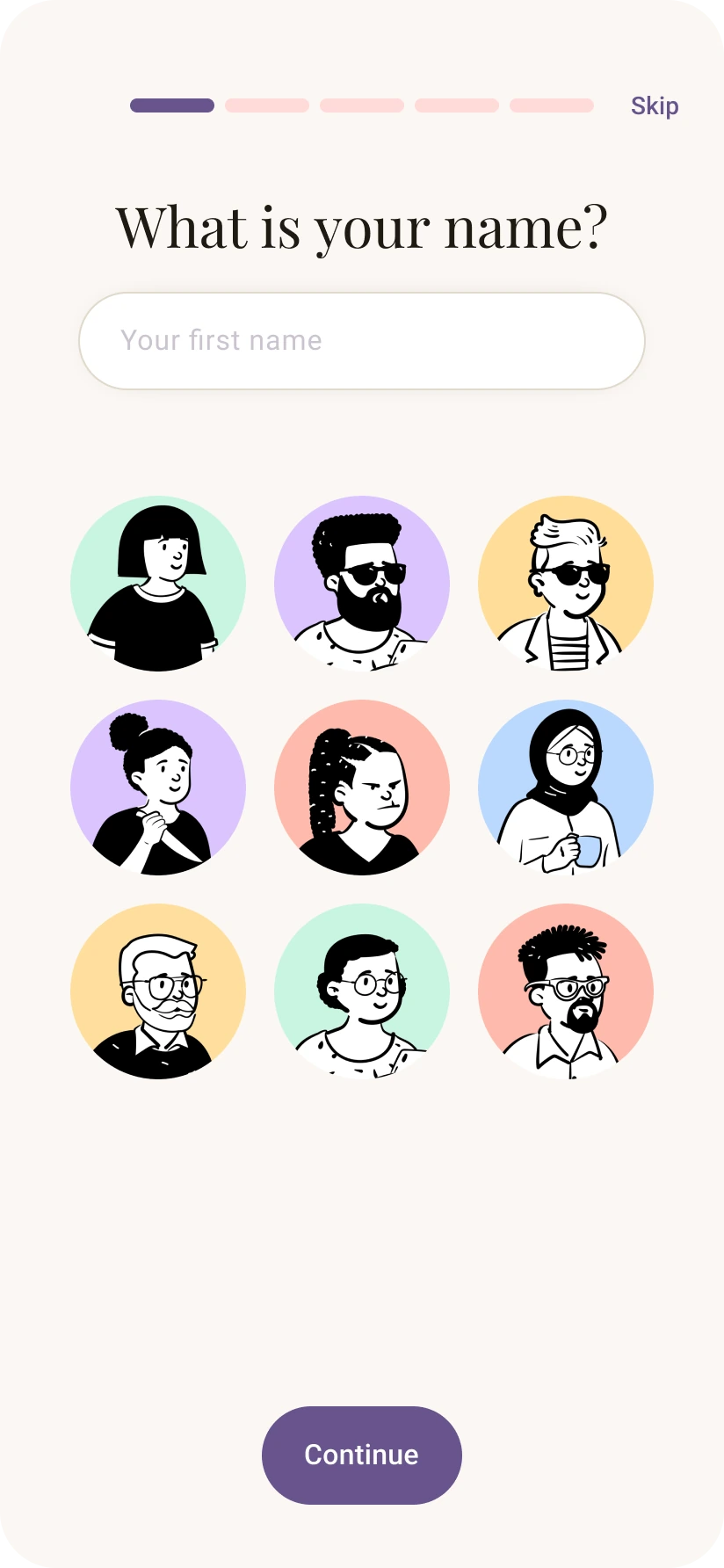
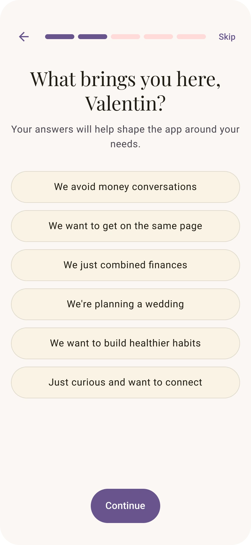
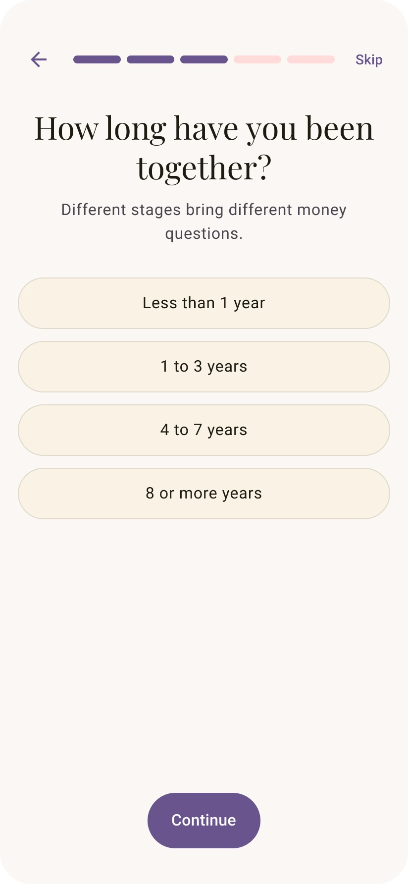
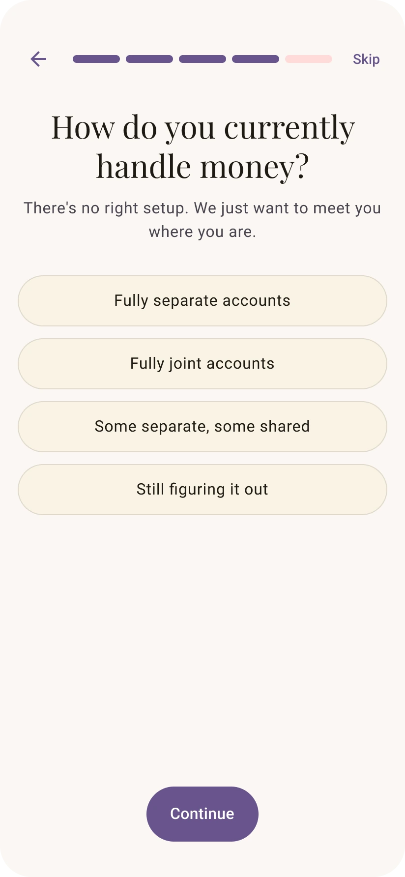
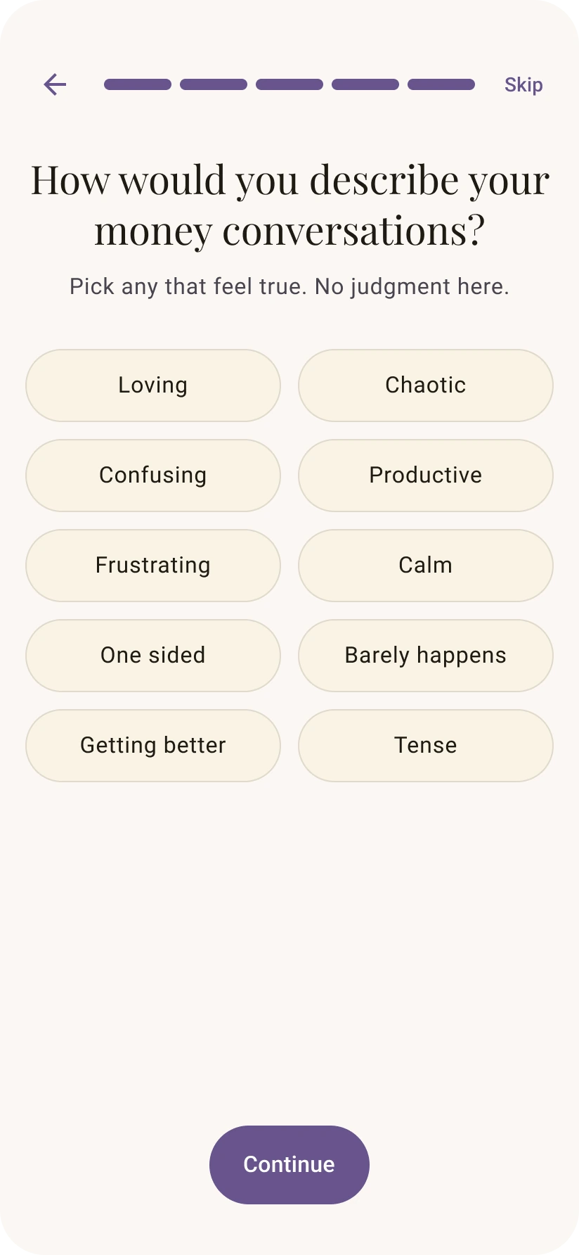
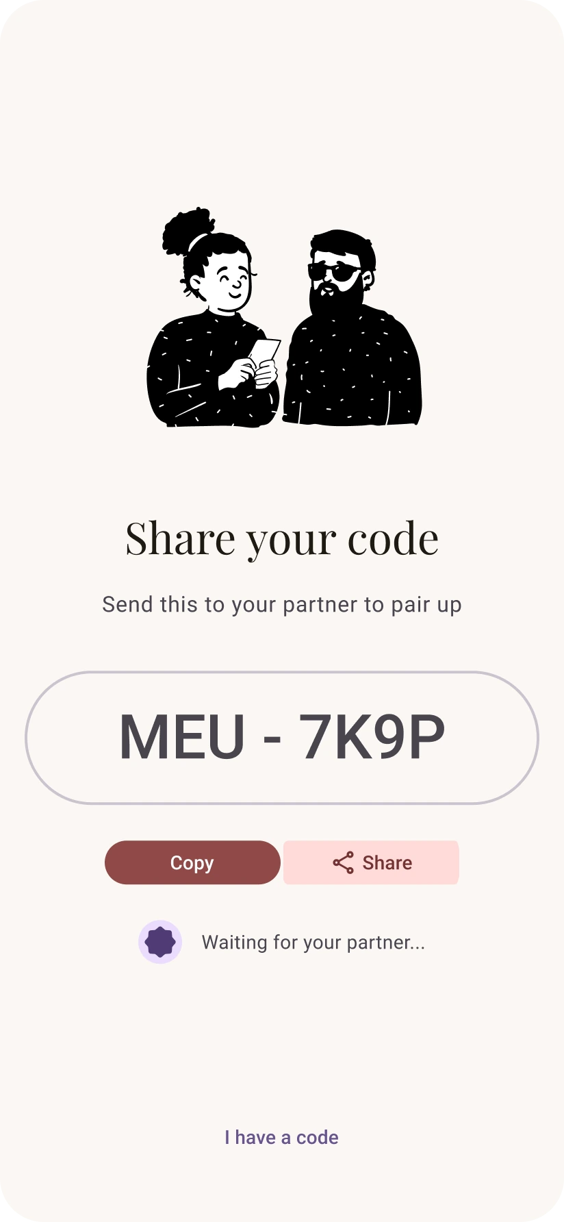
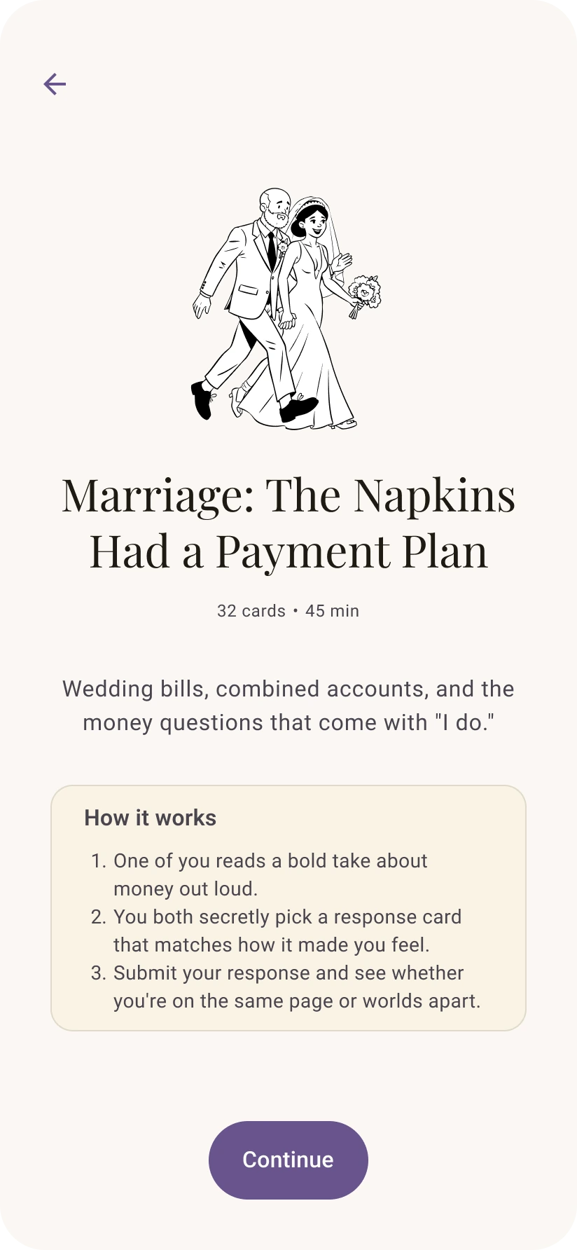
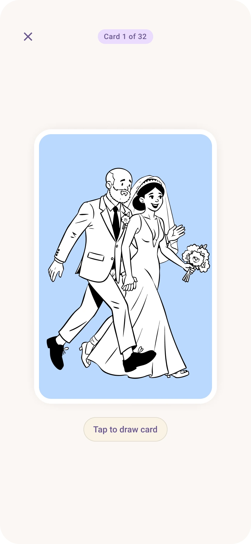
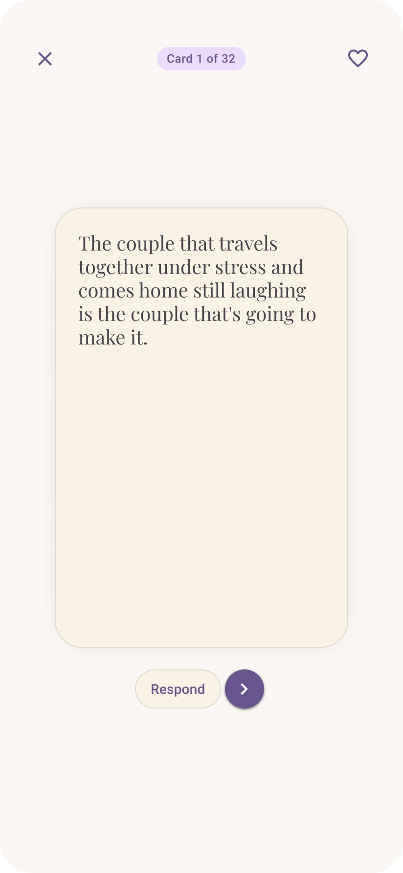
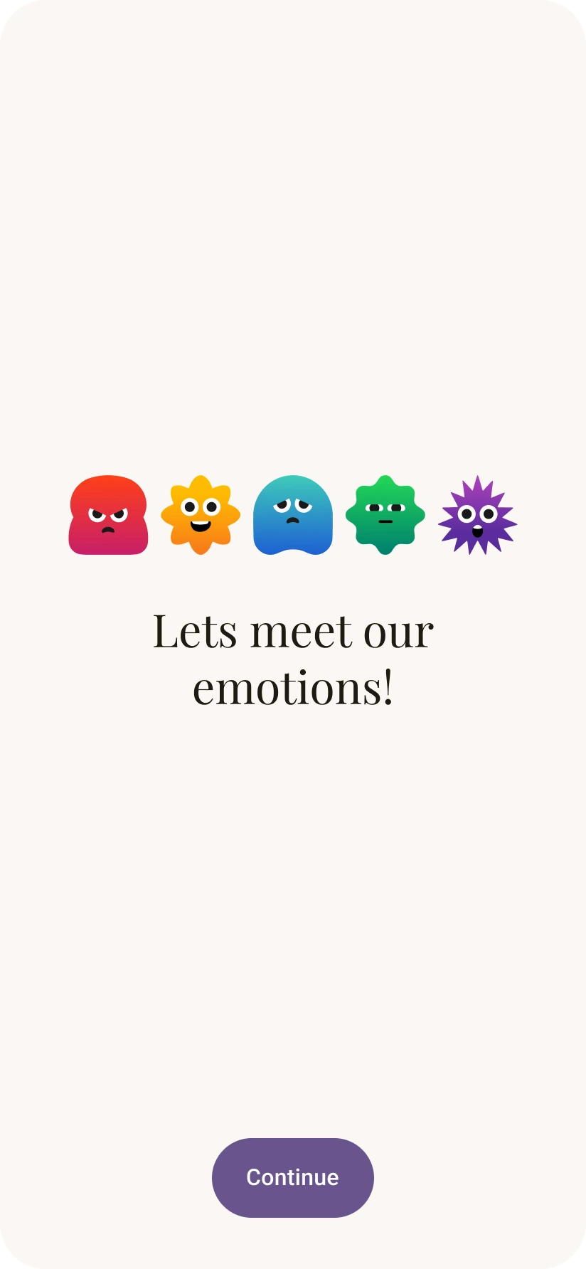
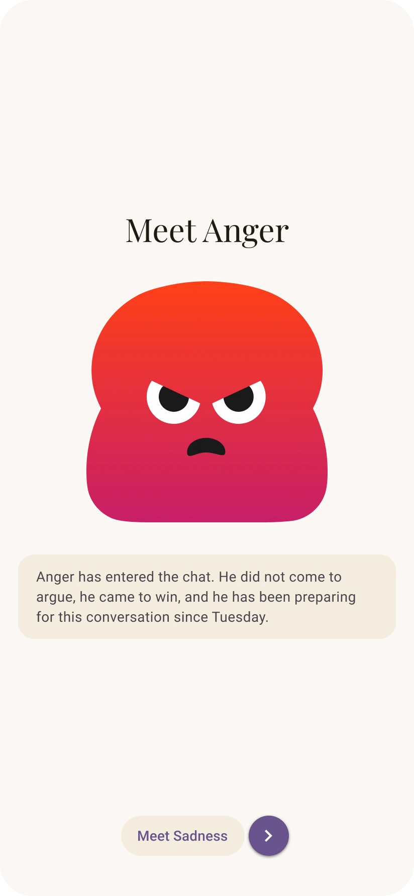
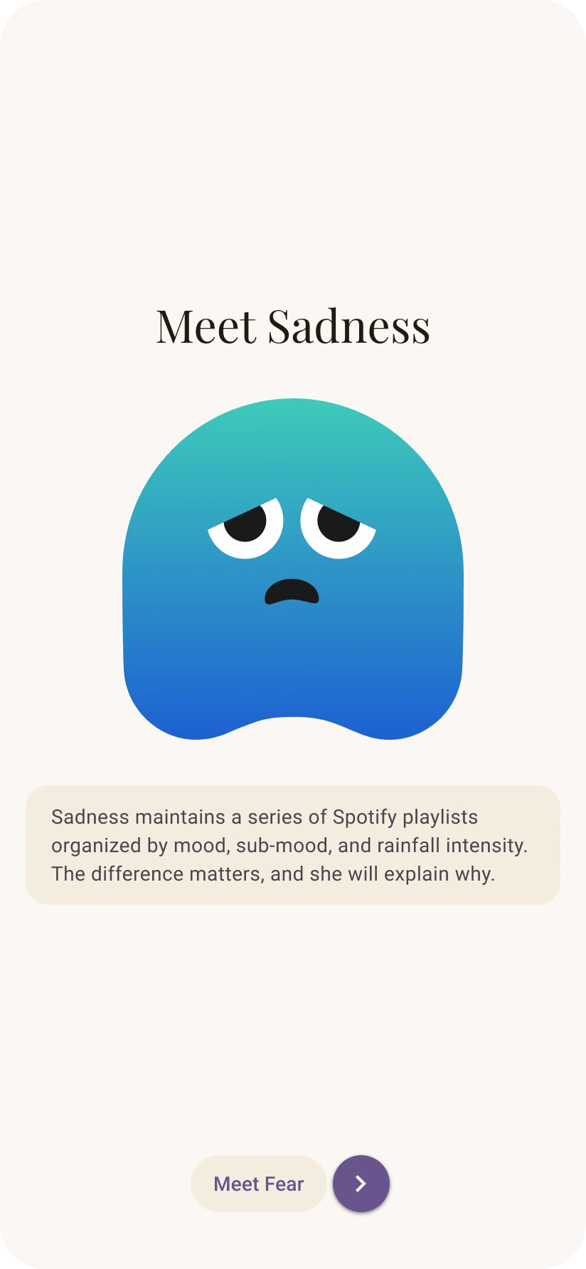
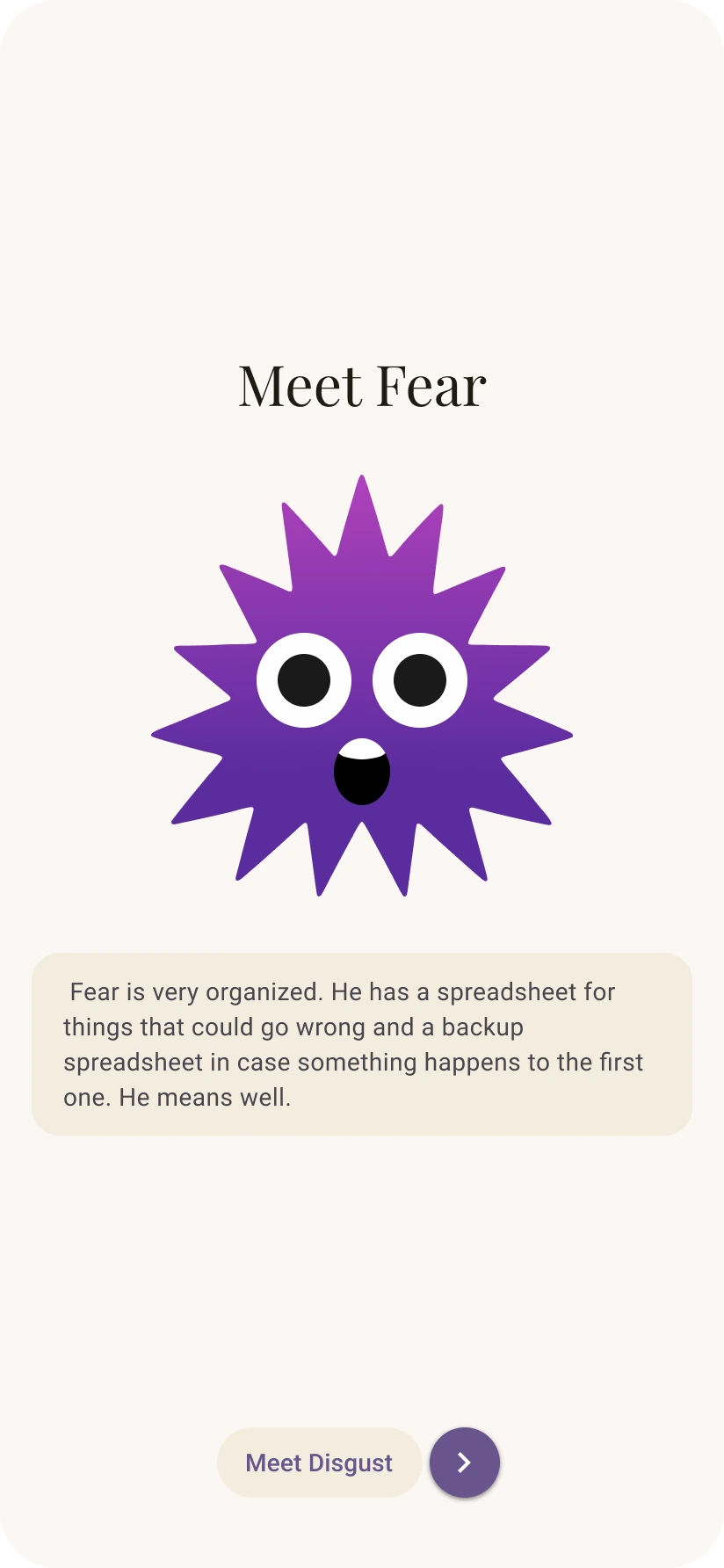
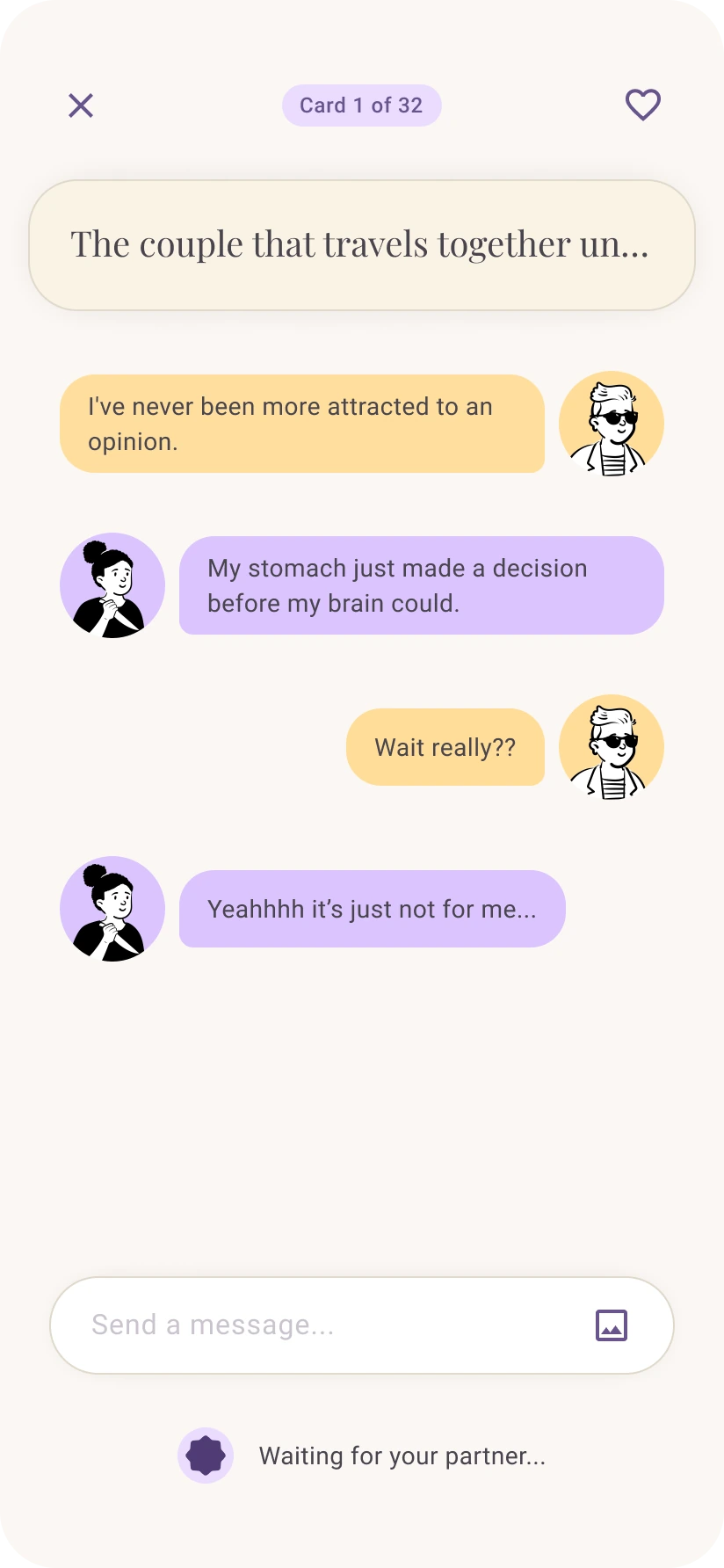
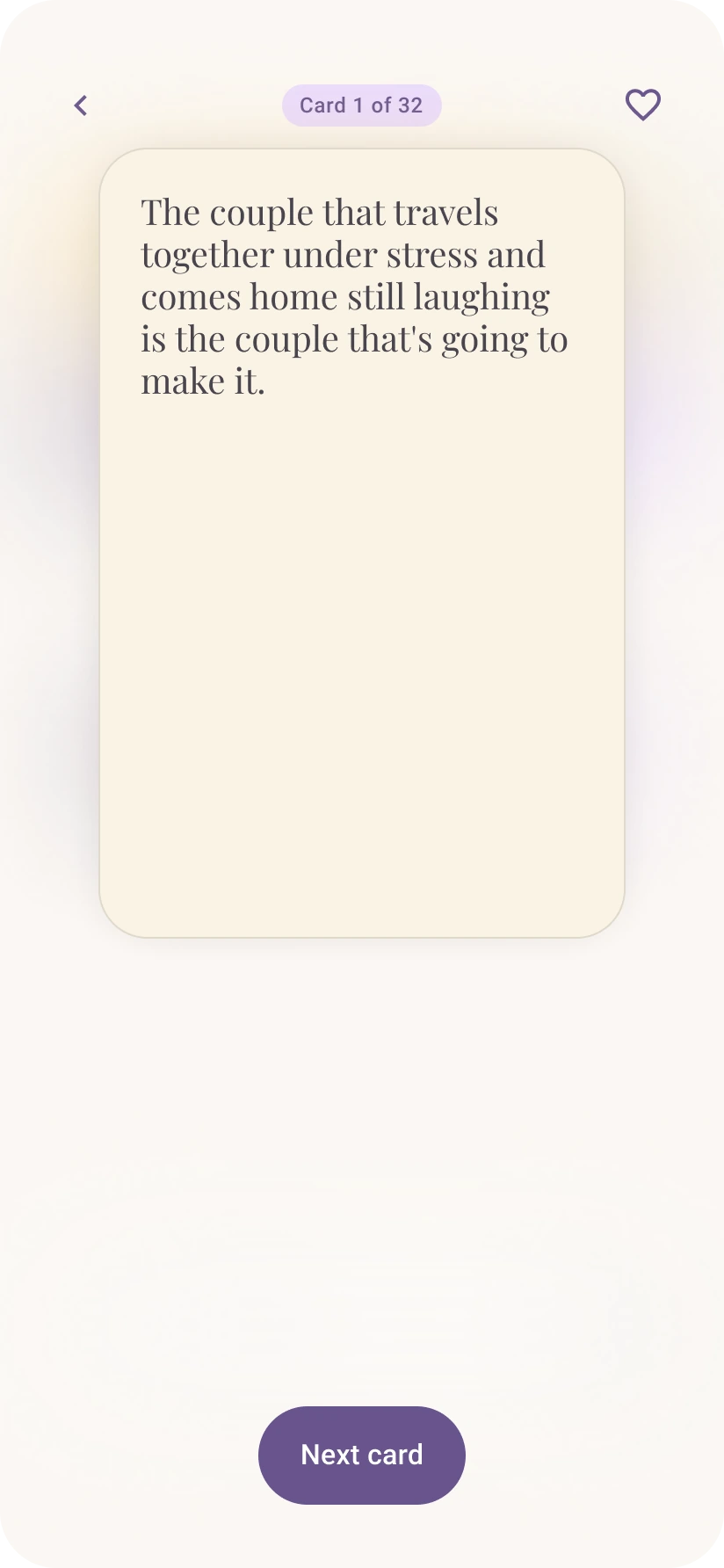
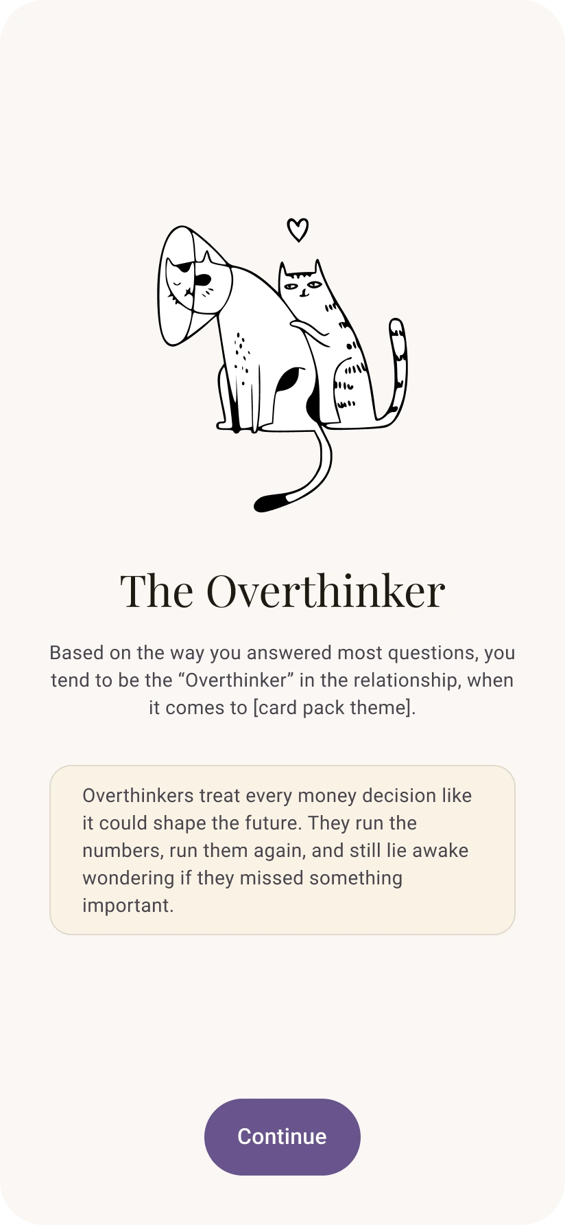
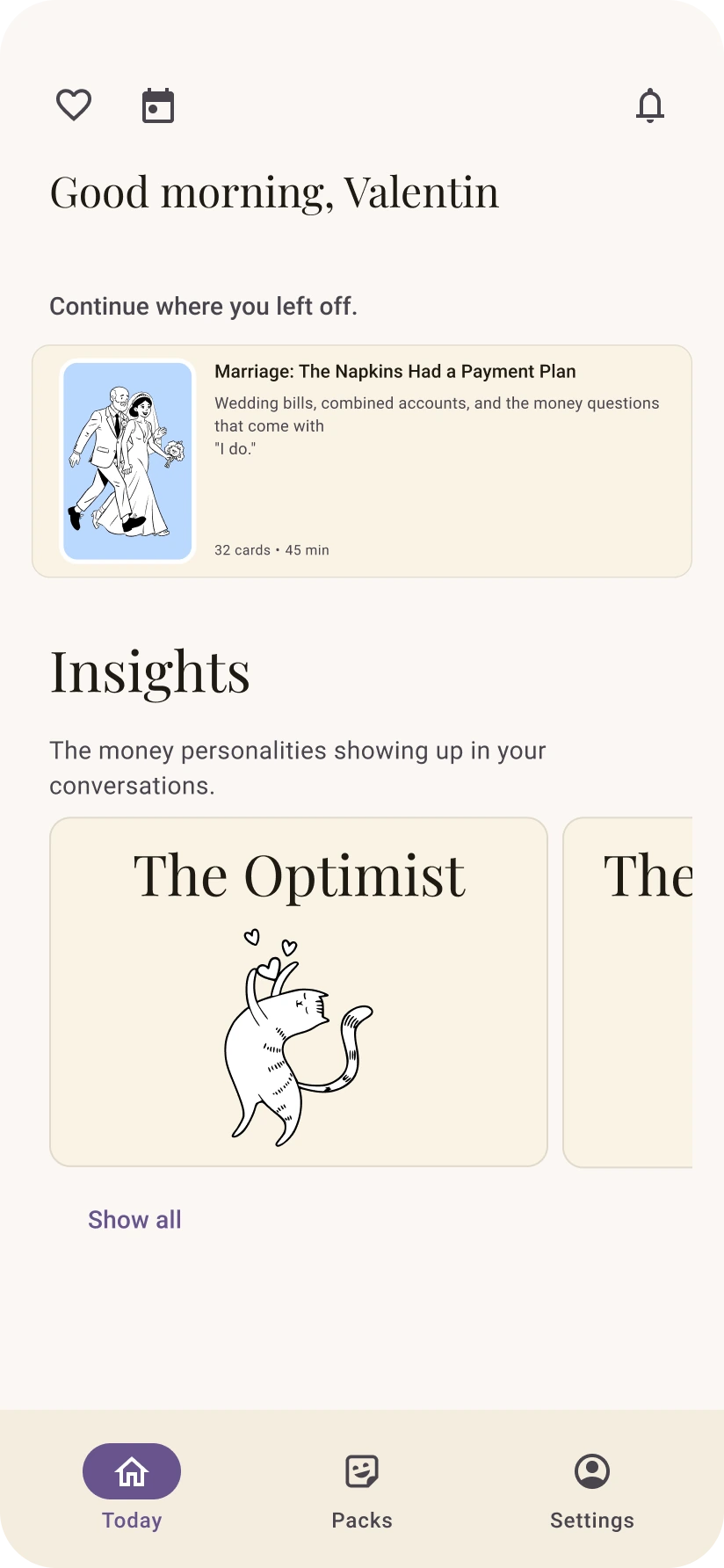
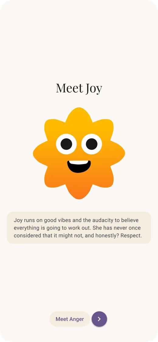
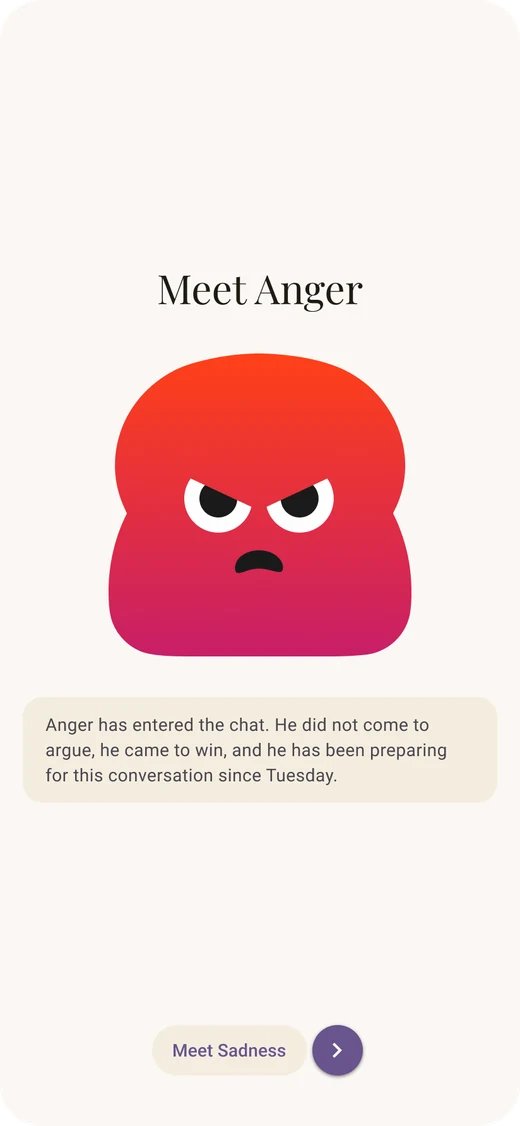
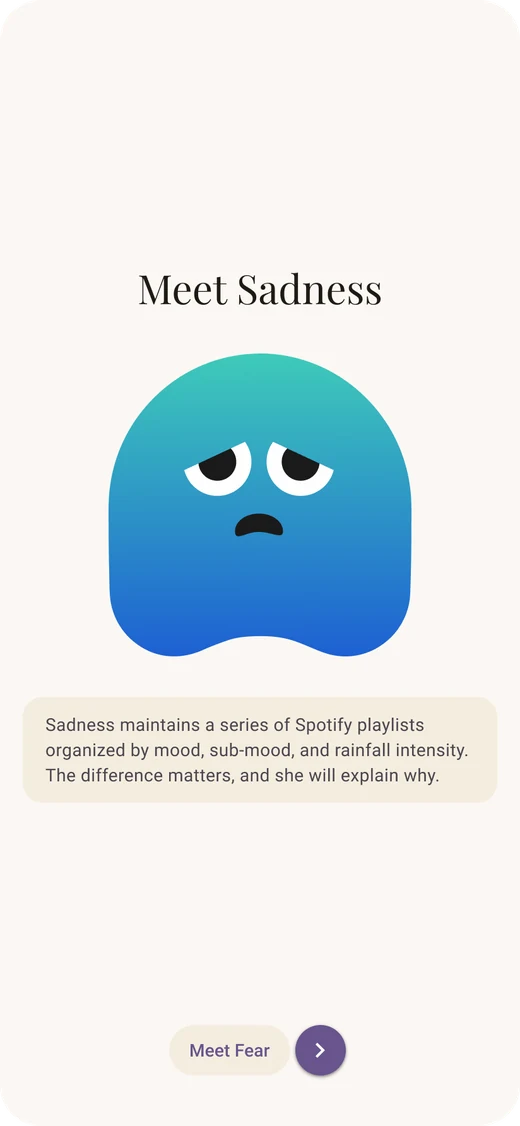
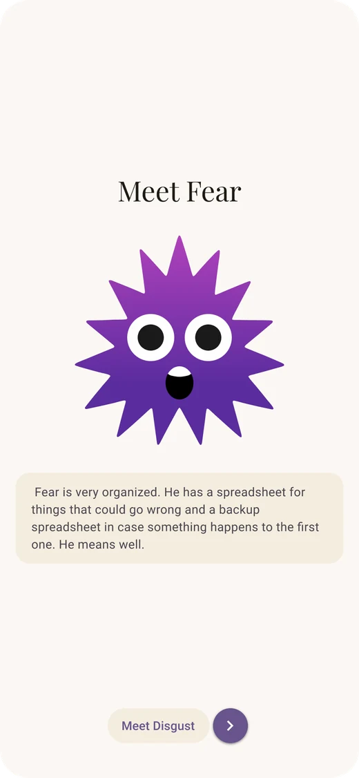
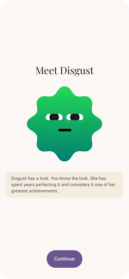
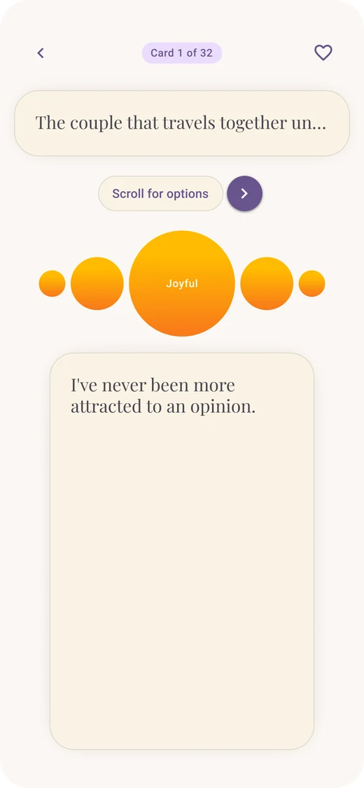
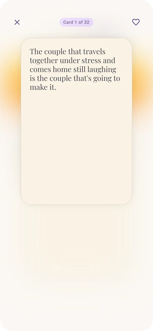
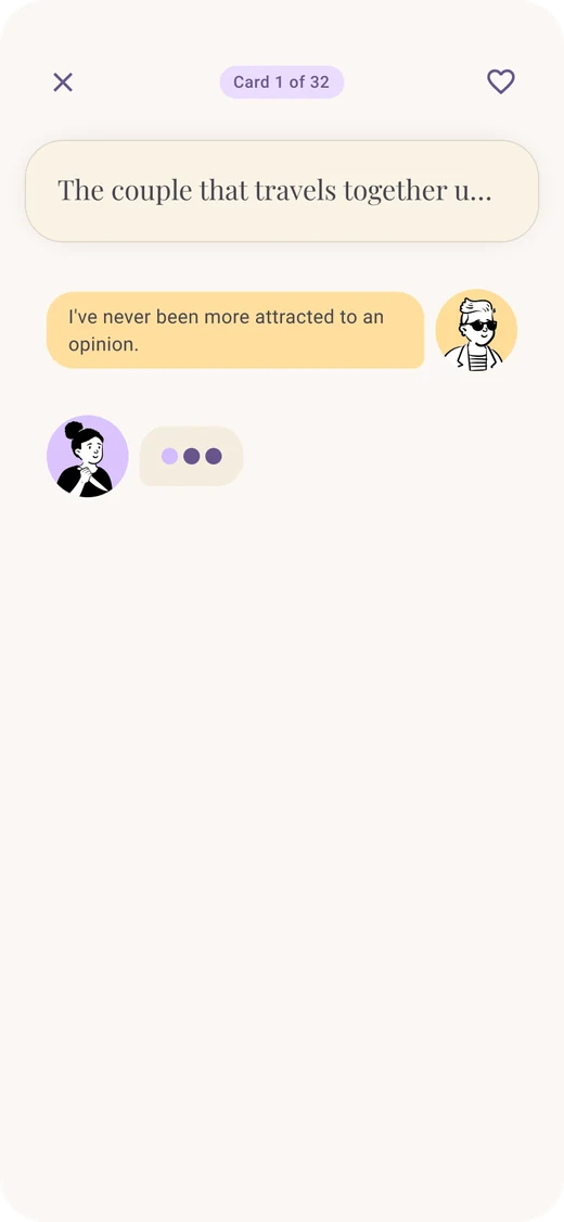
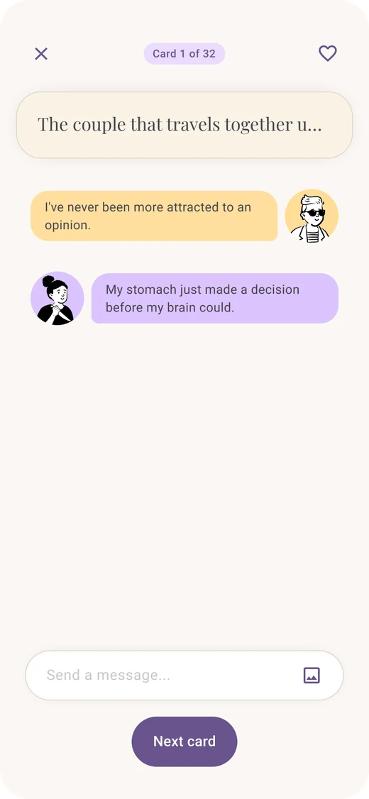
Welcome screen Name and avatar selection screen Onboarding question: what brings you here Onboarding question: how long together Onboarding question: how you handle money Onboarding question: describe your money conversations Invite your partner screen Share pairing code screen Paired with partner confirmation screen Notification permission screen Card pack selection screen Marriage card pack detail screen Before we start screen Draw card screen Card statement revealed screen Meet our emotions intro screen Meet Joy emotion screen Meet Anger emotion screen Meet Sadness emotion screen Meet Fear emotion screen Meet Disgust emotion screen Choose an emotion response screen Emotion response preview screen Card statement transition screen Partner responding chat screen Chat response sent screen Chat conversation exchange screen Waiting for partner chat screen Card transition loading screen Marriage pack demo complete screen Money personality result screen Home dashboard screen
Role
Product Designer
Timeline
8 weeks
Team
Solo
Tools
Figma, FigJam, Claude Code, GitHub, Vercel

My part. Interviews, concept, design, and a coded prototype I built and put in front of real users.

4
Couples interviewed, both partners together
5
Competitors analyzed
32
Screens in the working prototype

Problem

Couples share the money tools, but skip the conversation.

Apps like Monarch Money and Honeydue show couples the same numbers in nicer charts. None ask what they’re saving toward, or whether they agree. Money arguments are the strongest single predictor of divorce, and more than half of married couples never had a real money conversation before marrying.

Meuus doesn’t replace those tools. It sits next to them and gives the numbers some meaning.

Research

Couples want to talk about money, but need structure to start.

I interviewed four couples who already shared at least one financial tool, both partners together.

01

Emotion, inherited beliefs, and misaligned visions keep couples stuck

  • Money conversations carry so much weight that couples avoid them entirely.
  • Partners have detailed individual visions, but no shared one tied to their plan.
  • Inherited money beliefs create invisible friction.
02

Structure and guided questions unlock what couples can’t start alone

  • Existing tools solve for data, not alignment.
  • Regular money talks work, but most couples can’t stick to them.
  • Guided conversation surfaces what couples can’t always reach on their own.

Guiding question

How might we give couples a structured, trust building experience that surfaces their individual money identities, guides them through honest financial conversations, and helps them build a shared financial vision together?

Audience

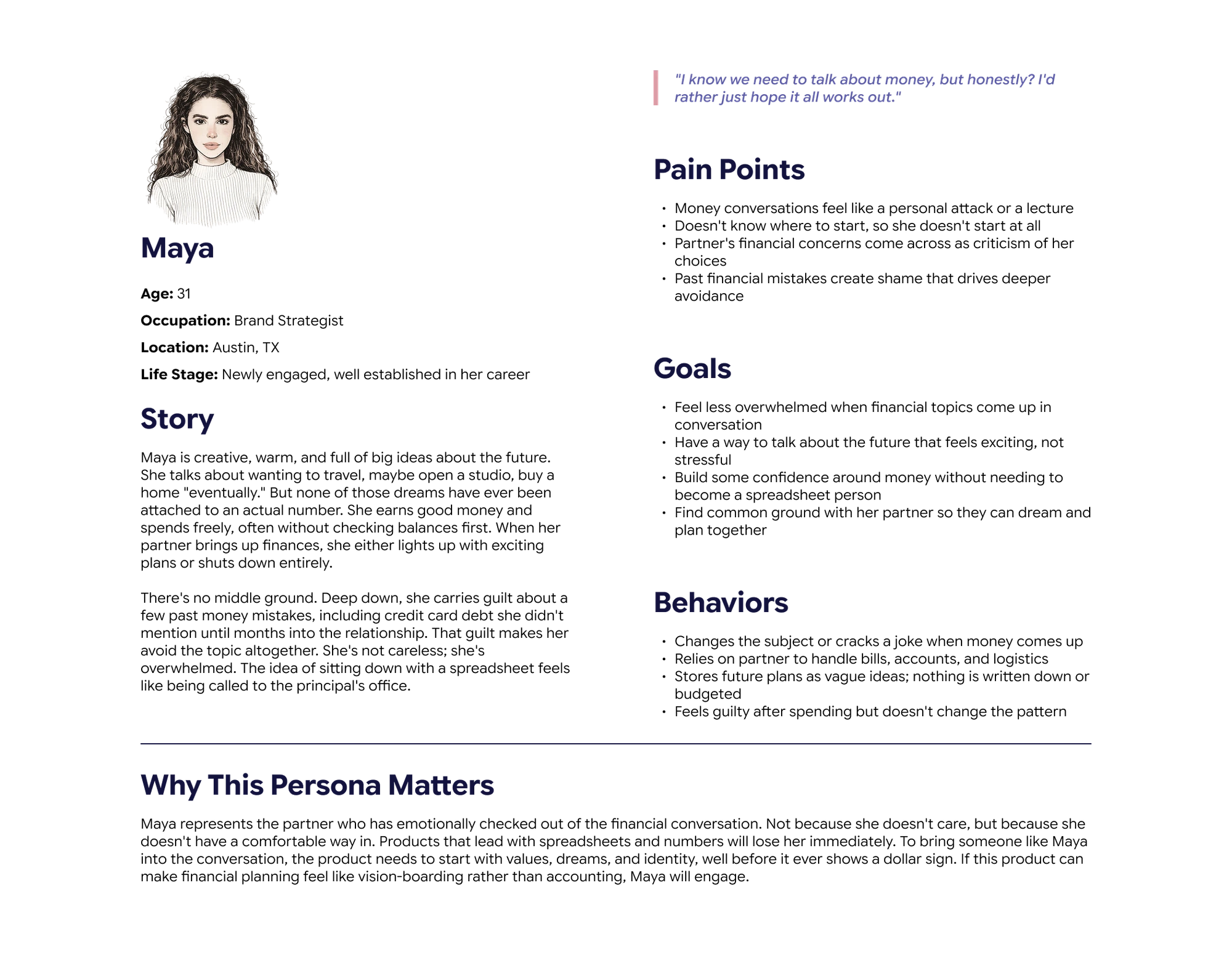
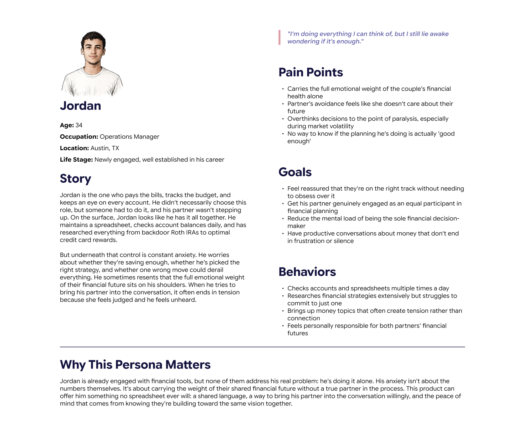
Two halves of a couple who rarely show up the same way.

The partner who avoids the topic, and the partner quietly carrying it alone. The gap between them is the tension the game is built to defuse.

Maya31, Brand Strategist. The Avoider.
Persona: Maya, 31, Brand Strategist, the avoider

Tap the image to view full size

Jordan34, Operations Manager. The Sole Planner.
Persona: Jordan, 34, Operations Manager, the sole planner

Tap the image to view full size
Solution

Turn the hard conversation into a low stakes game.

Partners draw a prompt card on a real topic, respond with an emotion instead of a paragraph, and compare answers. Nobody has to bring money up, and nobody gets blamed for starting. Enough cards reveal a money personality for each partner, something they can say out loud instead of a label that feels like a diagnosis.

Feature 01

The Money Cards

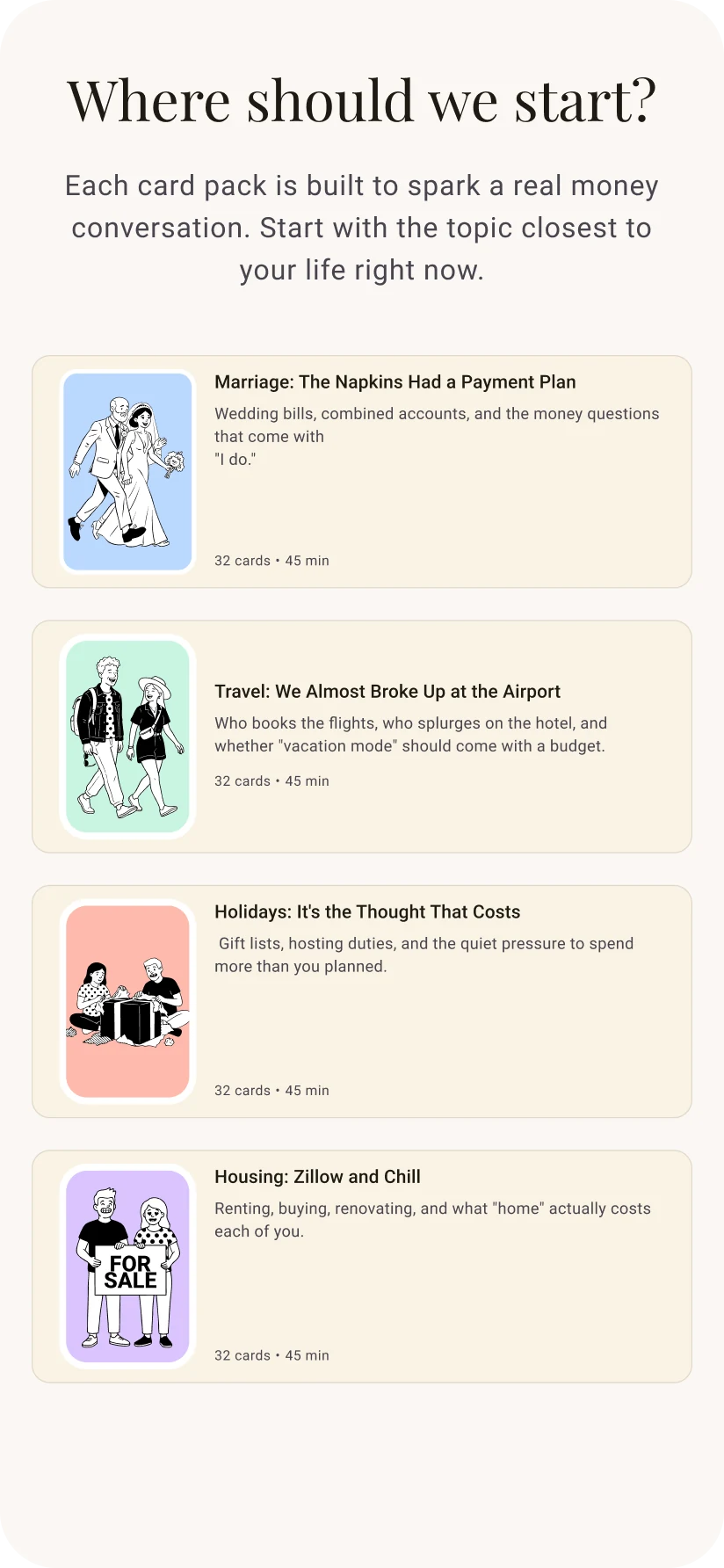
Four themed packs on the topics couples actually fight about, so the app asks the hard question instead of either partner.

Card pack selection screen

Feature 02

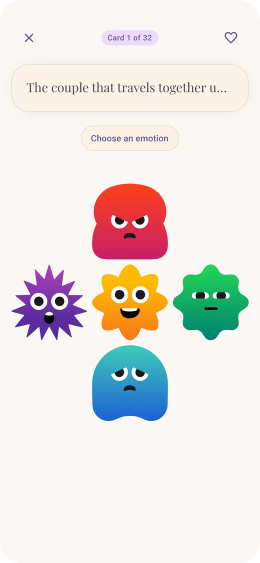
Vibe Check

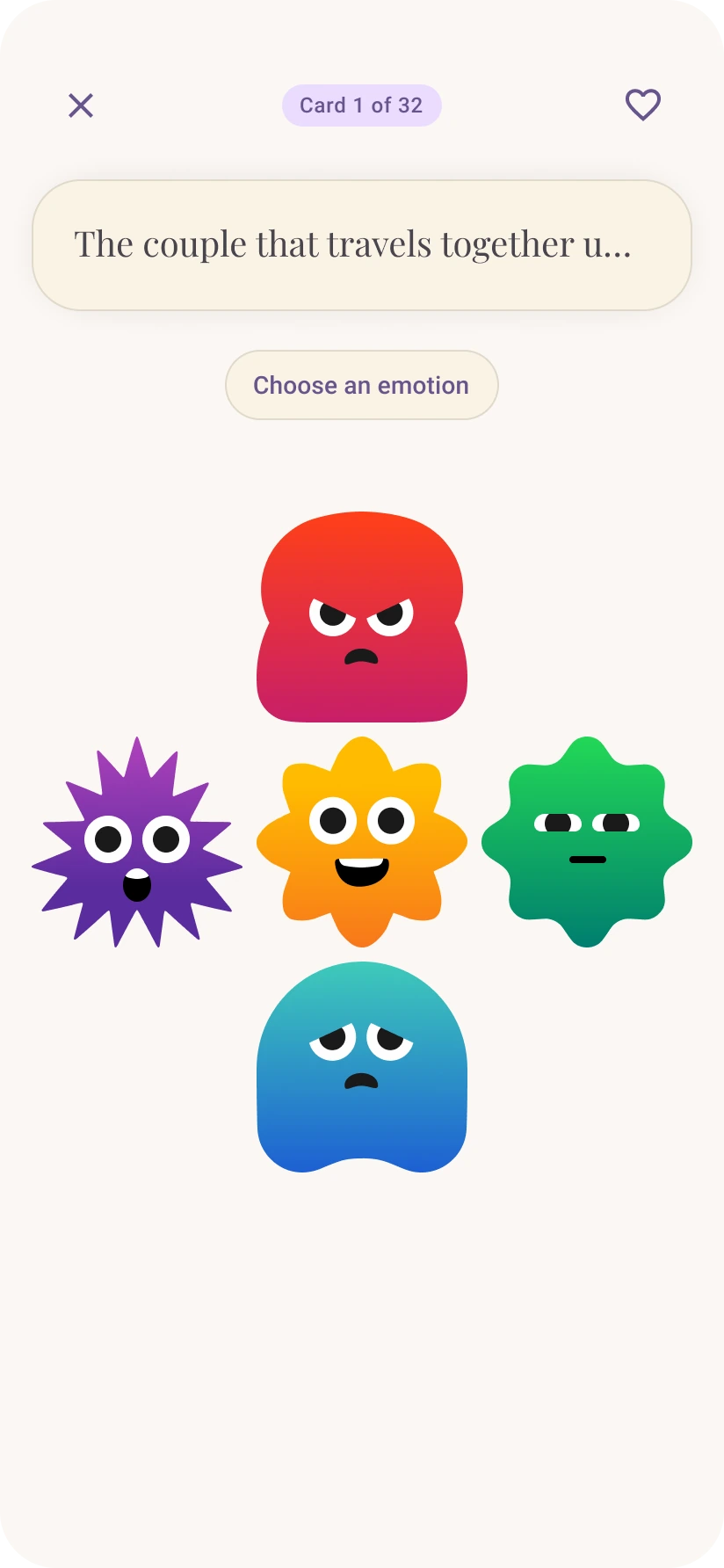
An emotion picker, borrowed from feelings charts used in therapy, lets each partner name a feeling before explaining it.

Vibe check emotion picker screen 1 Vibe check emotion picker screen 2 Vibe check emotion picker screen 3 Vibe check emotion picker screen 4 Vibe check emotion picker screen 5

Feature 03

The Game Loop

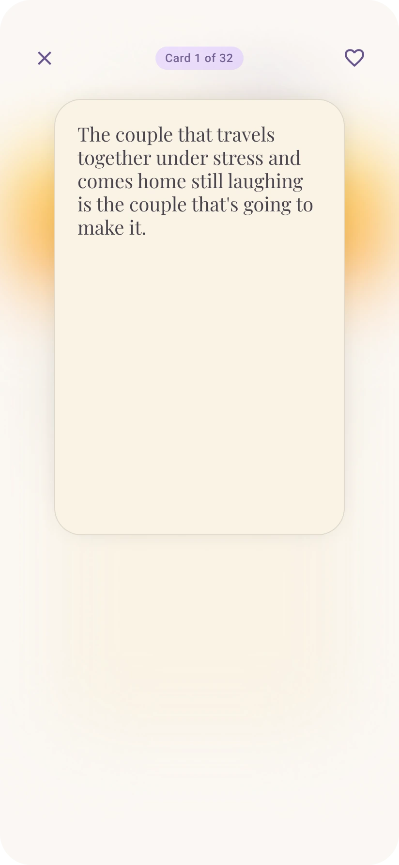
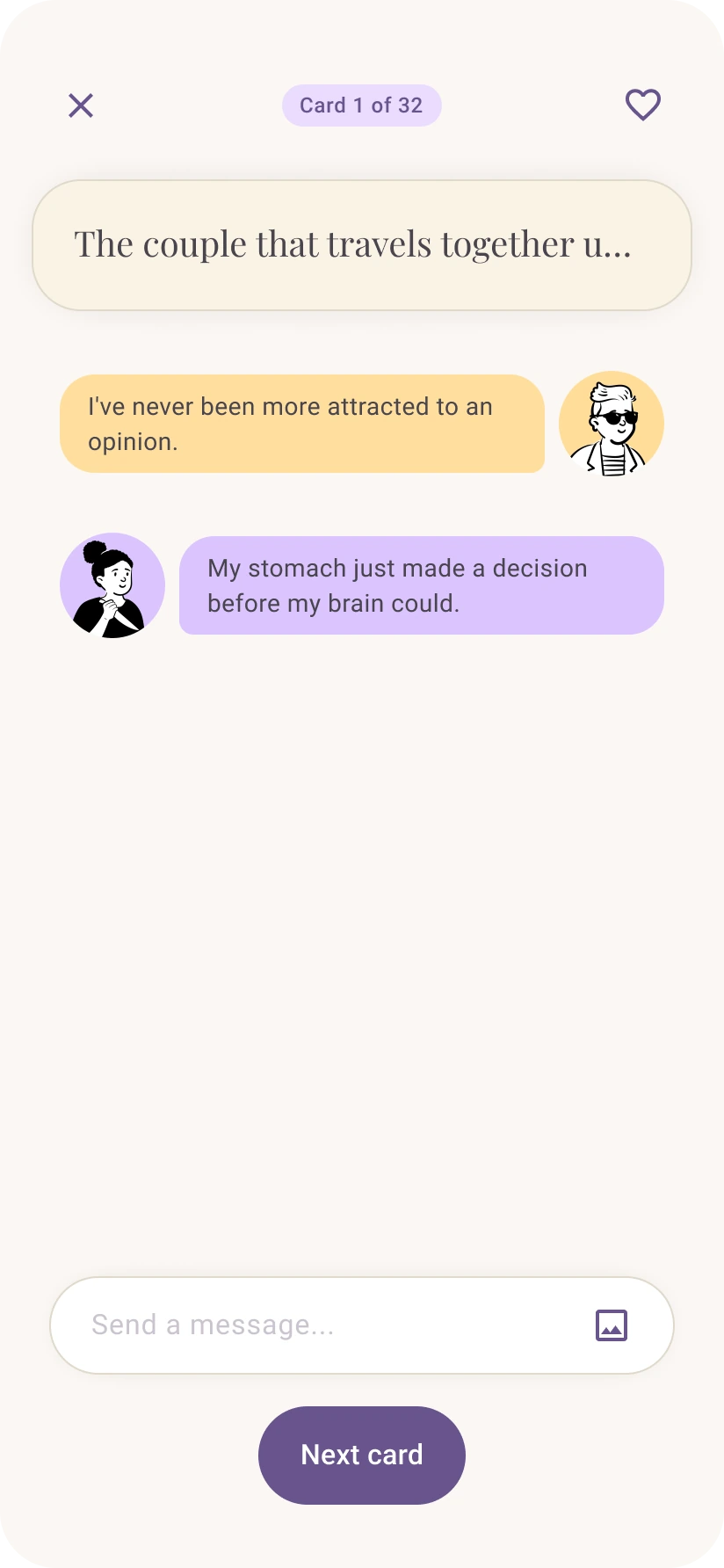
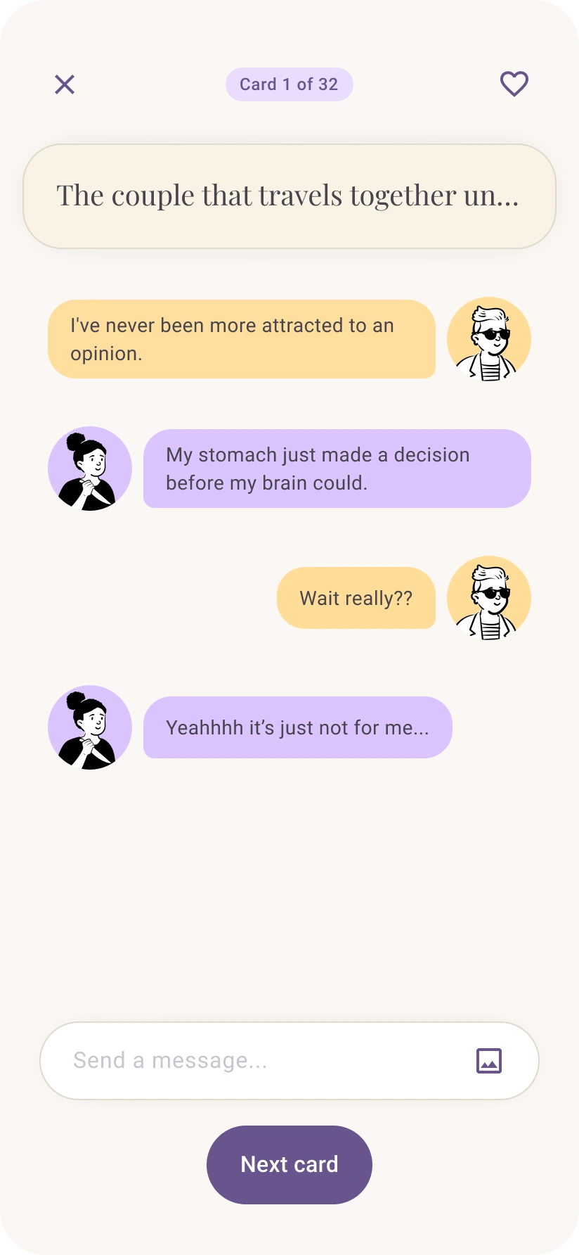
Draw a card, pick an emotion, then leave it there or open the chat and say why. The loop repeats through a whole pack.

Game loop screen 1 Game loop screen 2 Game loop screen 3 Game loop screen 4 Game loop screen 5

Feature 04

Craft your experience

Avatar and profile setup that feels like building a character, not filling out a form.

Avatar selection screen

Reflection

Validating the problem early made every later decision easier to defend.

When I cut a planned feature or renamed the money types, I had interview evidence to point at instead of a preference to argue for.

Building the prototype for real was the right trade.

It cost days I didn’t have in an eight week timeline, but watching real users play the game made it much easier to see what was working.

Made it this far? I guess we're friends now...

I'm open to product design roles and freelancing.

Lets work together!
© 2026 Valentin Paz Tello — designed in Figma, built with care.